


Chapters
Rethinking Engage - a comprehensive analytics solution for HR in large companies. A brief story on how we approached the redesign and did not get lost in almost 130 screens.
So, what is the product we redesigned?
Betterworks Engage (back then known as Hyphen) is a successful product, which had been developed over 3 years of focused work from distributed teams. As their competition in the space of employee analytics became more fierce, the team identified the user experience and the user interface of their dashboard software as big selling points in the industry.
The technology was there, it was simply not that easy to use.
The platform connects company management and HR with the employees through surveys, polls and sentiment analysis of online conversations. An example use case would be:
- HR wants to analyse the onboarding experience of new employees.
- They create a survey and select the “Onboarding” category.
- Employees can answer the survey via a dedicated mobile app, a web panel or directly on Slack.
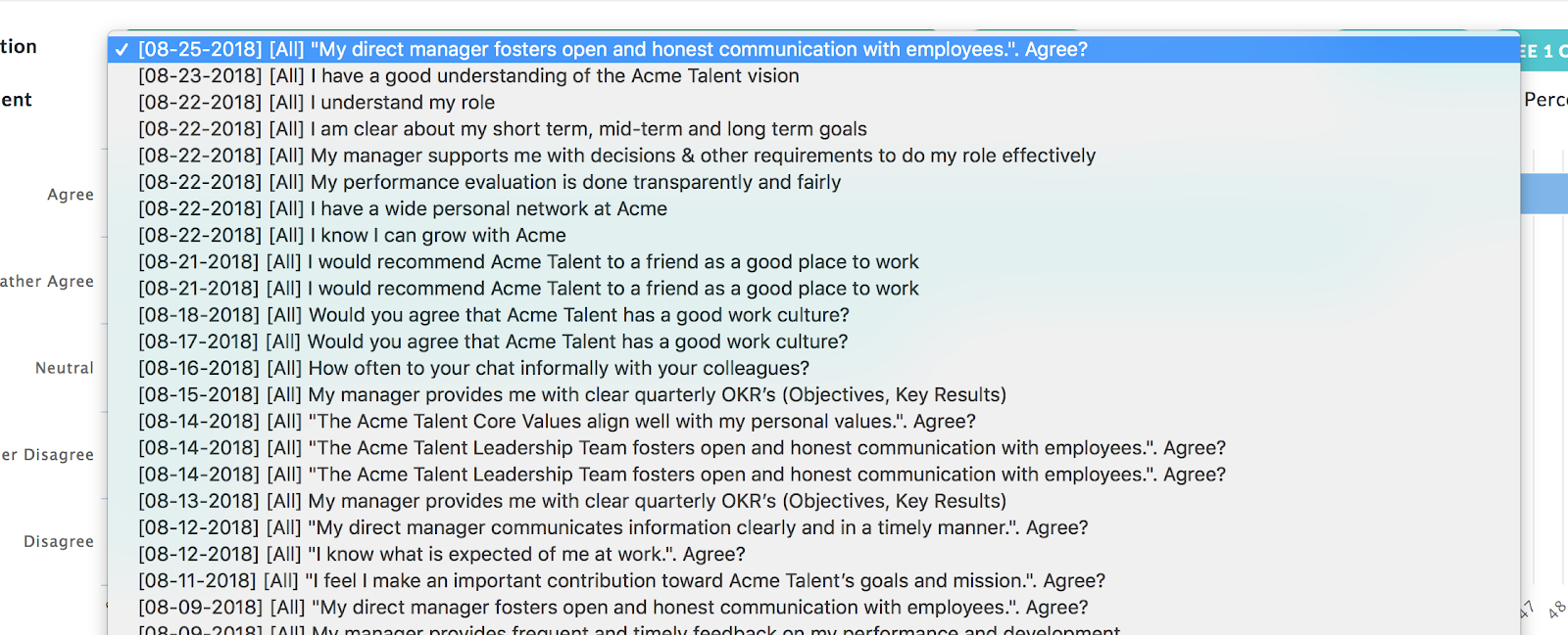
- The HR can review detailed results of the survey (both quantitative and qualitative results) in their Betterworks Engage web app, supported by extensive filtering capabilities.
 The "before" version of Engage (Hyphen) included a dashboard and a navigation which did not entirely support the core user flows.
My job, as the lead UX Designer in the project was to look at the Insights panel and provide the HR teams around the world the best possible experience of collecting, analysing and using employee data in a meaningful way.
It wasn’t a simple task, as there were almost 50 multi-level report screens and a number of creator and settings screens, which were in a dire need of a redesign.
UX Strategy
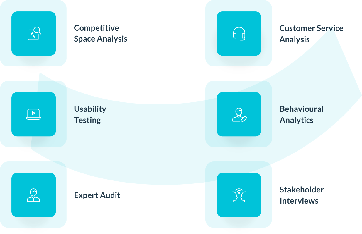
EL Passion’s design team always does as much as possible to understand the context of the user experience and the core problems that need solving. The 360-degree research approach from our team over the course of 2 weeks involved:
- Expert audit of the current user experience
- Usability testing with HR managers to look at the UX from their perspective
- Stakeholder interviews with team members previously involved in creating the product
- Analysis of customer service logs
- Review of behavioural analytics of the current users
- Analysis of the competitive space
Why did we leave the competitive analysis as the last step?
By the time we started the work, the tool was already in use — that means that there is a lot to learn from. We could look inside the product, instead of tapping into inspiration from the outside.
A 360-degree perspective
The first step to analysing a user experience of an application, you need to check where the problems lie currently. Apart from Google Analytics stats, we hit a jackpot in customer support logs. What could be a better place to understand the customers’ pain points than the very place they go to for help?
Even though I did my master’s degree in HR, I have never worked in the field, so I couldn’t pretend to be an expert. There was a need of real HR managers to look at the product and give us honest feedback. Even just testing with 5 people reinforced some of the points my colleague Tomek and I found in the current user experience of Engage.
The problems we needed to solve to help Engage succeed
The core issues were the functional architecture of the application and the understandability of certain key features, which prevented the users from extracting maximum value from the application’s offering.
The architecture and the navigation was a patchwork
Like many other applications, Engage’s features were gradually developed. Sometimes it meant adding a new item in the main navigation, but sometimes it meant squeezing in a feature in the place that it doesn’t belong, in order to avoid the whole structure from falling apart.
There were several problems with navigation through the application, which was related to the way particular screens were grouped and to the fact, that they didn’t necessarily support particular user flows in the application.
In other words — the tasks HR people were trying to do were not accessible from a single screen — they needed to go in circles through many screens in the app while doing one thing.
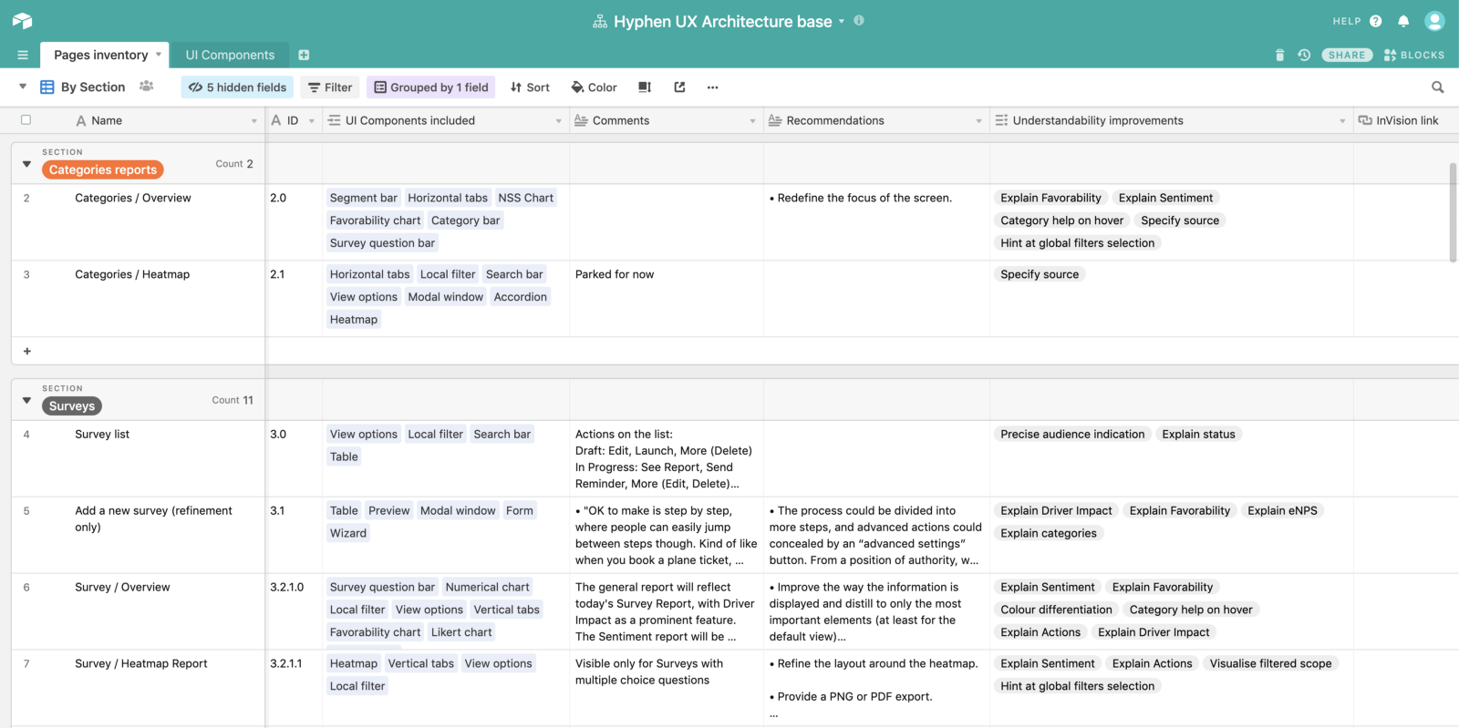 Airtable was extremely helpful in creating a repository of all screens, features and UI elements.
UI inconsistencies made the product difficult to learn
When I explain the importance of UI consistency to my trainees, I always say this sentence:
The more consistent each of the elements is throughout an enterprise application, the less effort is needed to learn and remember the interface. The less effort is required, the more meaningful will be the work produced in the tool.
The same applied to Engage — the same functions were sometimes built by different teams and ended up working or looking a bit differently. The users were getting confused and often wrote to customer support to ask how to use a feature again.
 If the same feature is looking differently across different screens, the users will have a hard time finding their way around the application.
5 small usability problems can turn into 10 big user experience problems
When analysing user experience, we often look out not only for high-level issues. The small problems matter a lot too, especially when they aggregate in tens or hundreds across 50 different application screens.
Some of the usability concepts we took a close look into were:
- System feedback:
There were many instances in which there is an action happening in the system, however the user was not informed of what has happened. For instance deleting or resolving an item.
 Elements should not disappear from the screen right after clicking - the user might miss it and be left puzzled with what actually happened in the app.
- Choosing appropriate UI controls:
Some UI control types have not been chosen for maximum usability. There are a number of places where users need to use long dropdown lists or displaced radio buttons.
 Sometimes a static list with a search filter can be more user-friendly than a huge system dropdown.
- Lack of user help:
One of the biggest problem of certain features and microcopy was the lack of explanatory information. Due to the complexity of certain components, it makes the system difficult to learn. We couldn’t expect first time users to know terms such as “Driver Impact Analysis” or features such as heatmap reports.
This deep holistic approach gave as a very deep understanding of the problems that the users of the application are facing, as well as primed some thinking about potential solutions. With all the new ideas in our heads, we needed to hold our horses and start designing very slowly, in order to avoid making the same mistakes.
UX Design
Architecture
Based on the full breadth of findings from the UX Strategy phase we decided to focus on UX Architecture first. What was important for us was close collaboration with the client and their developers, which resulted in revised architecture schemes for the full application. We used them as our main communication tool in the first days of the UX Design phase.
Our aim here was to make the application easy to navigate and to provide clear ways to jump between the reports and not get lost in the hierarchy.
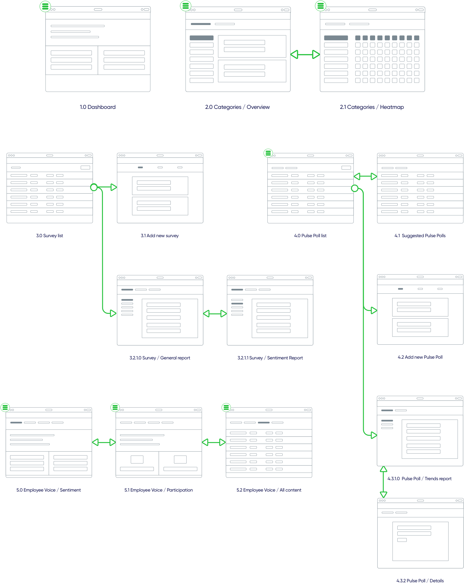 This was one of the numerous flows we created when trying to find the best way to navigate in the app.
Devising the way to navigate
The application had to provide a clear way to navigate and show hierarchy of certain modules, therefore we spent a couple of iterations on designing a robust and scalable 3-level-deep navigation.
Our focus was to collect all elements related to one feature group, e.g. Surveys, and to place it in a single place in the main navigation. Before the redesign this wasn’t the case it partly the reason why users got lost.
Let’s remember that navigation menus are not only for going between the screens, but also for showing an overview of the structure of the application.
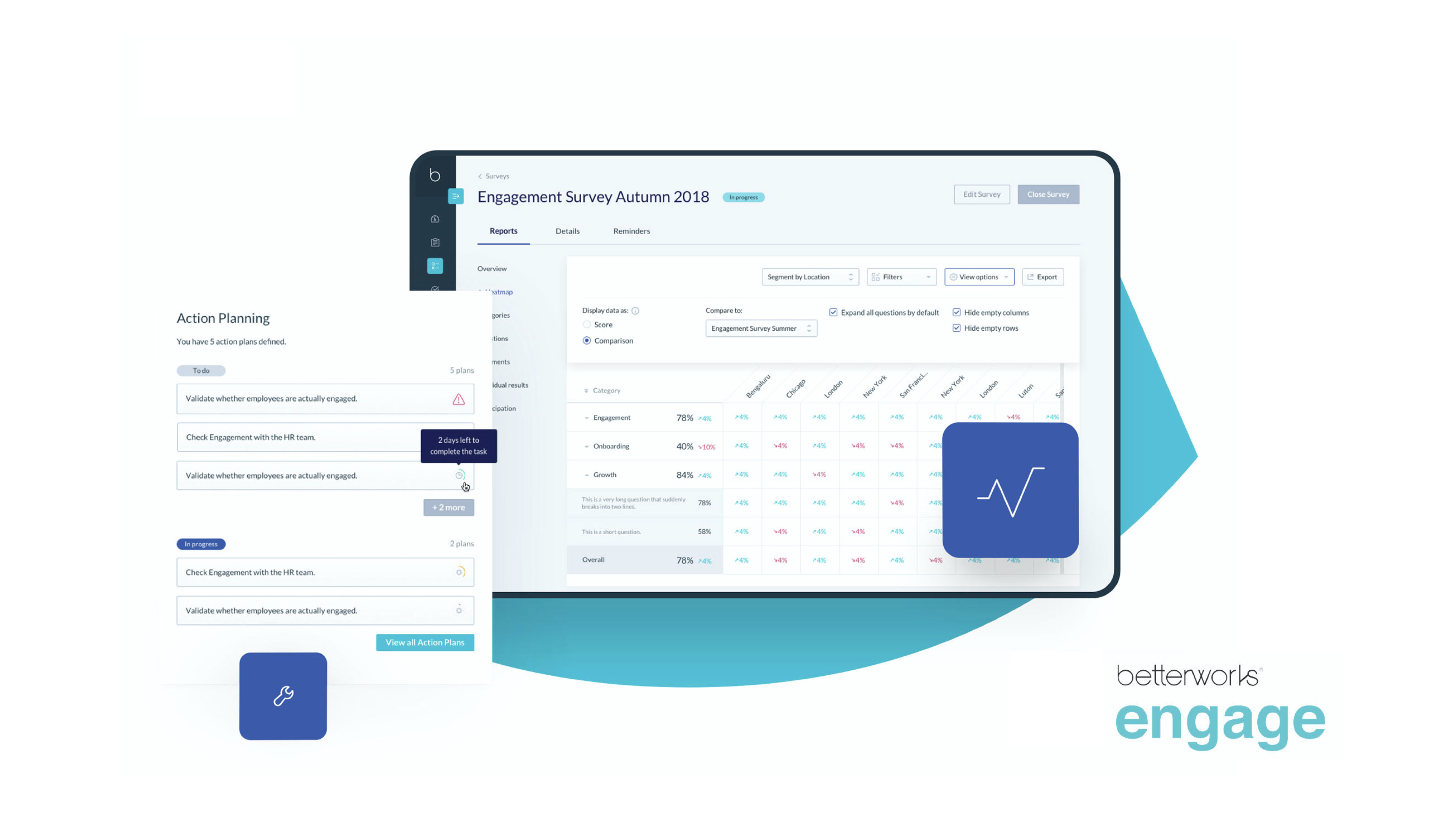
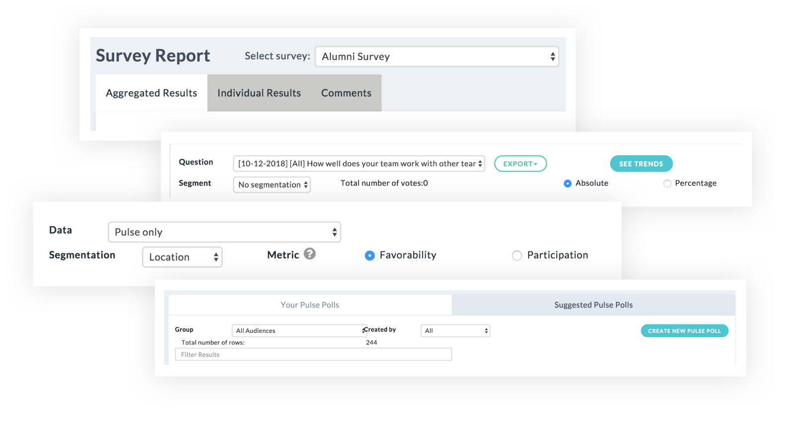
Within an instance of a survey, as you can see on the screenshot below, we carefully crafted the division of reports to separate tabs, while keeping easy access to other information about the survey. This supported the HR’s workflow and allowed for quick overviews of the progress of a survey.
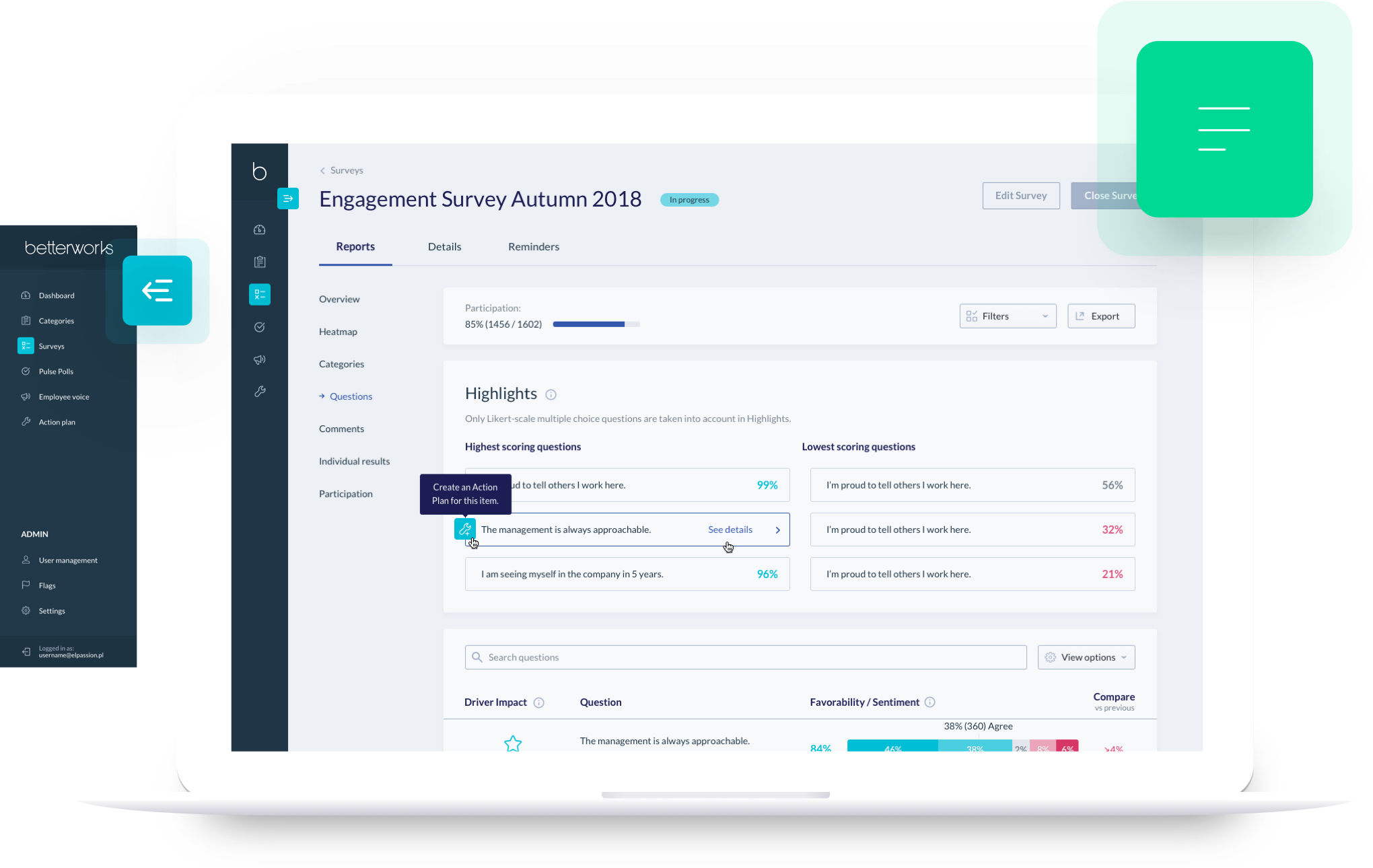
Survey creation needed to flow
One of the biggest challenges for the users in the current version of the app was the process of creating and launching a new survey. Instead of a fixed, tabbed approach, we incorporated an easy-to-use wizard pattern to walk the user through all of the steps of survey creation.
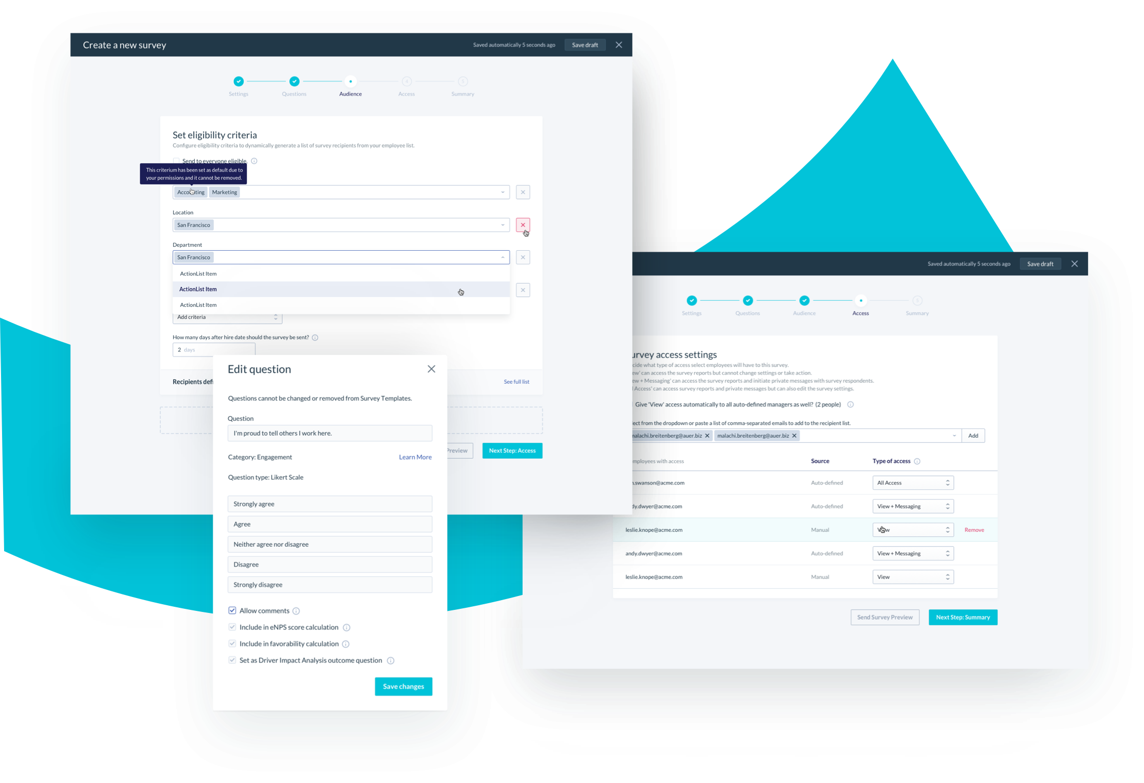 Splitting complex processes into steps can simplify the flow and make it less scary to users.
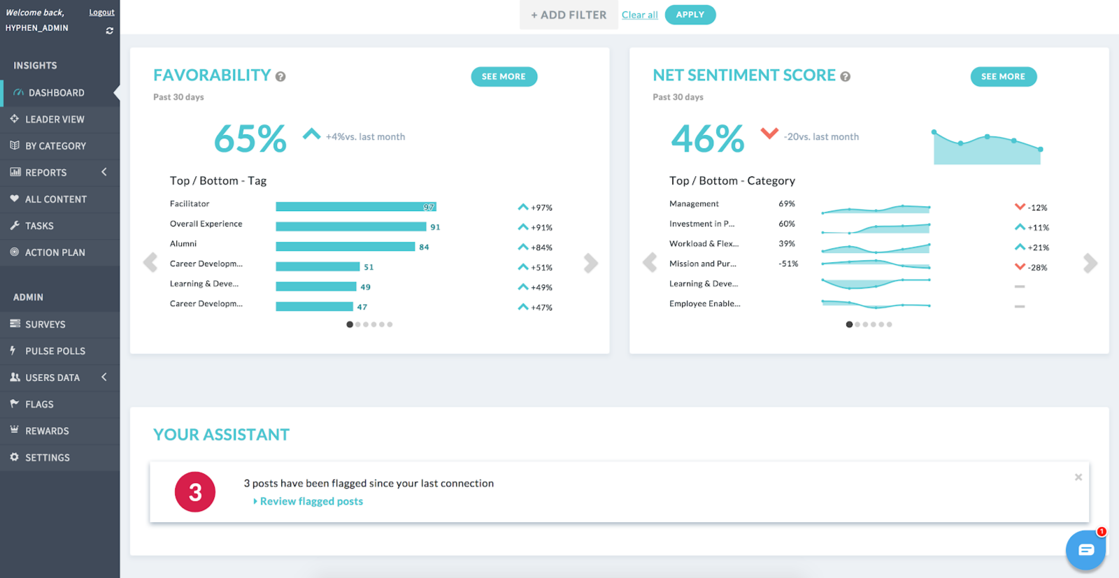
Approachable data visualisation
Obviously the value extraction for the users was supposed to come from viewing various survey reports.
The focus here was choosing the best possible way to visualise certain data points, enable easy data comparison and filter through big sets of data. We used patterns such as bar charts, stacked charts, heatmaps and bubble graphs for different purposes throughout the app, which proved to be a good way to differentiate types of data.
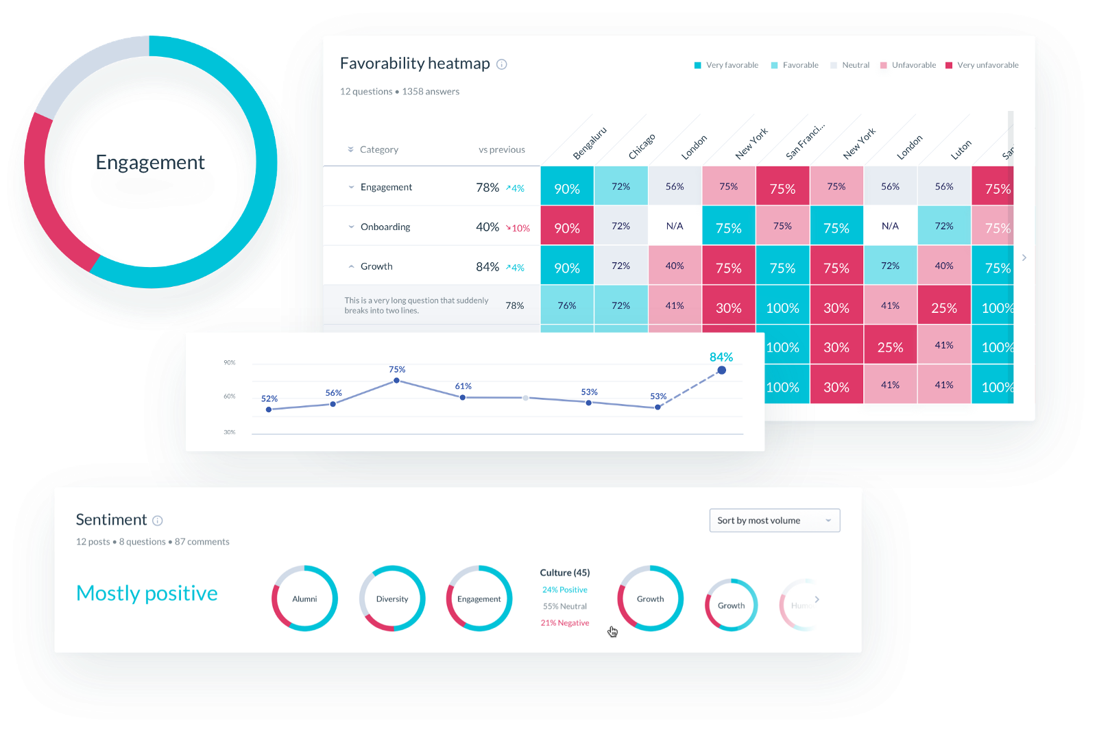 We carefully chose the right type of data visualisation for each report, including linear, bar, heatmap and pie charts.
Aren’t those wireframes a bit too hi-fi?
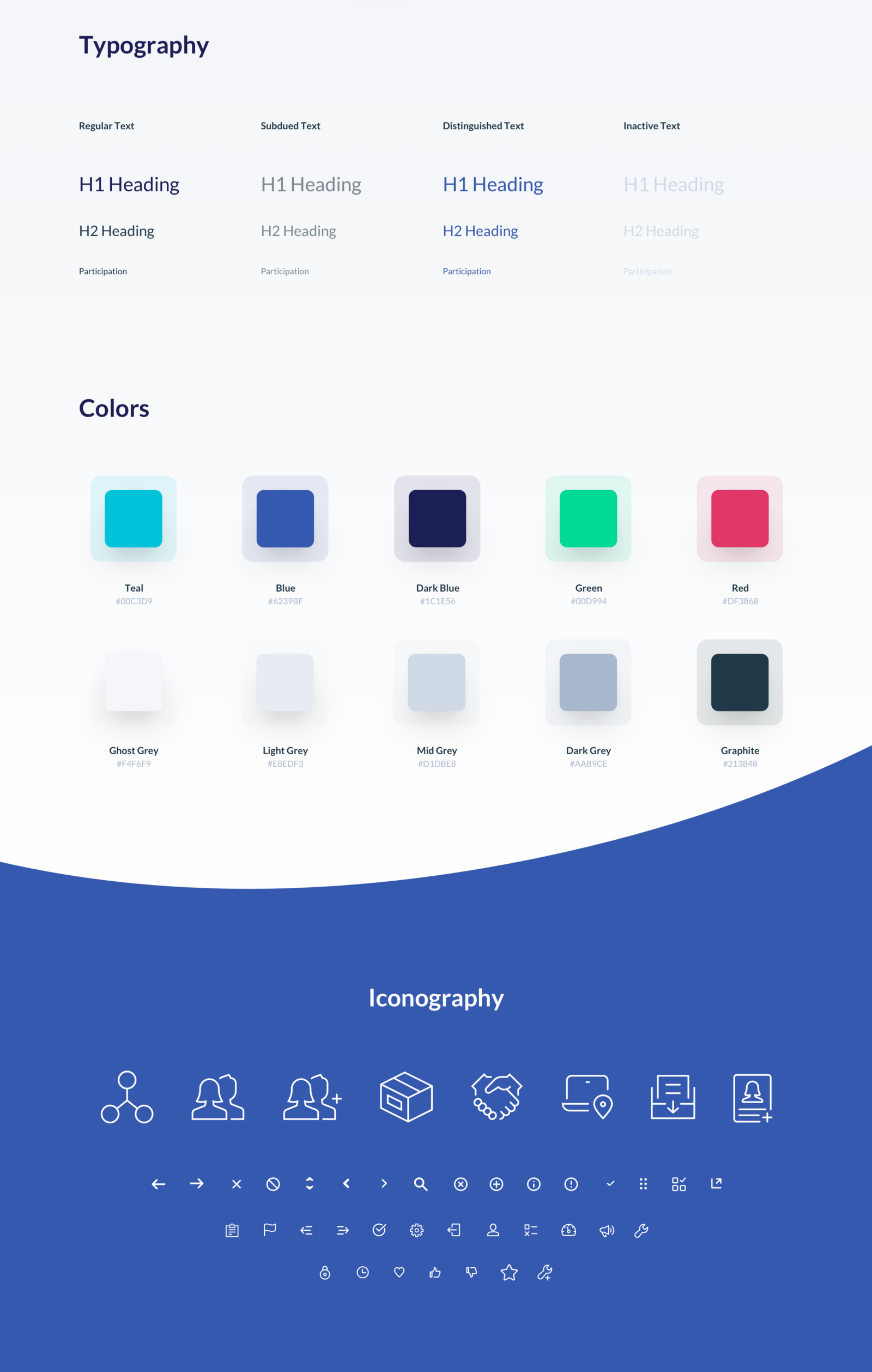
Well, we started designing the interface by creating a simple style guide to help two designers work on the same experience and avoid duplication of work. We leveraged Plant and Sketch’s Shared Library features to optimise the design operations.
 Plant was the perfect version control tool for us in the project.
That way, we were able to make it easy for the client to gather feedback early, and for us to establish a clear visual style of an enterprise app that is supposed to be solid, usable and not too flashy.
A robust clickable prototype allowed us to gather solid feedback throughout the process and communicate with the client.
We ended up with almost 150 screens in our InVision project, that’s why good design ops was crucial to manage global and local changes.
The final effect
Customer feedback has been incorporated into the process to gather more needs and problems the users would like solving. Betterworks Engage (Hyphen 2.0) is available at Betterworks.com, and the features we redesigned are being rolled out incrementally, as I am writing this article.
- UX Strategy & UX Design services — Michał Mazur
- UI Design services — Tomasz Nadratowski
Check out also
- Case Study: Unlocking The Power of a Remote UX Workshop - See how we helped our client establish a viable and in-depth roadmap for their digital product. All in virtual collaboration.
You may also like


AI Washing in Product Design: How to Spot It and Avoid Fake “AI-Powered” Features
27 March 2026 • EL Passion
We’re available for new projects.
