


Chapters
Product design is a little bit like cooking. You need to have quality ingredients, a recipe, a well-equipped kitchen, and finally: a skilled cook that will put everything together into an easily digestible form.
It’s a bit of a stretch, you’d say?
Let me explain the cooking metaphor in more detail to show you what I mean.
You can say — I’m not a cook, I use products from the supermarket and my burrito is fine as it is. Sure! I’m not saying that in order to prepare a nice meal you need all the things mentioned above.
But you don’t go around advertising it’s the best burrito in town and trying to make a living out of it.
It’s 2020 and there’s still this notion that anyone with some basic graphic skills can design a functional app. Following Gartner, mobile apps’ commercial success in 2018 was 00.01 percent — one successful app out of 10,000 apps.
To design that one app, you need to step up your game. This case study’s goal is to picture the process we went through while designing a Healthy meal app concept, and how we tried to apply the cooking metaphor to each of the steps we took. Enjoy!
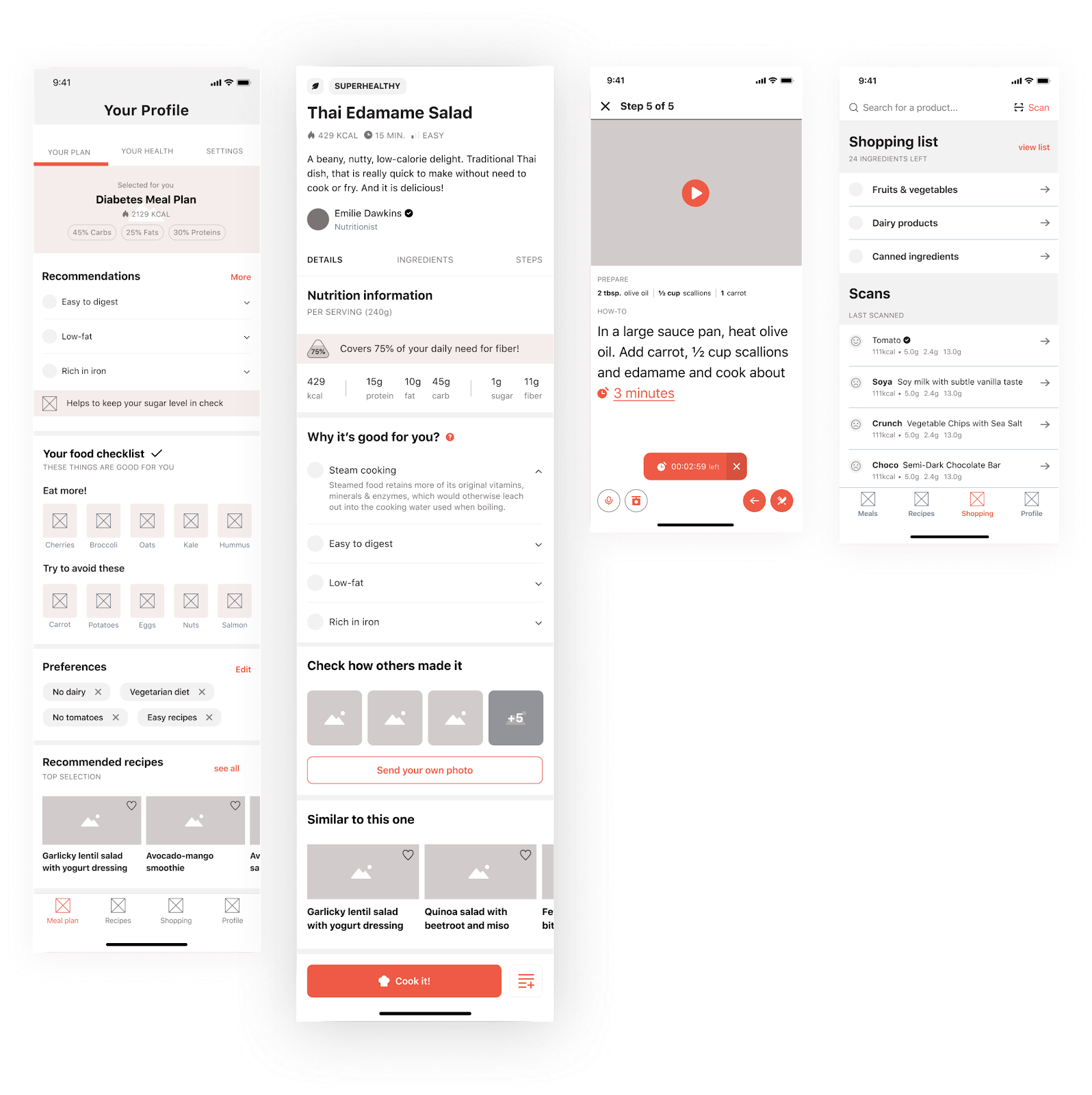
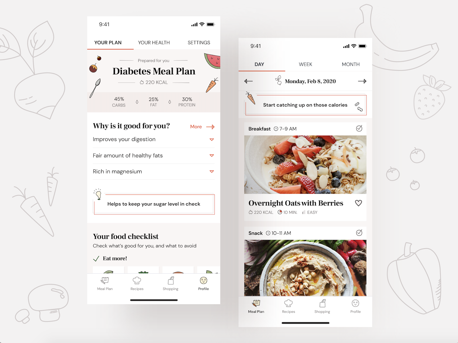 A Healthy Meal app final screens. See more on Behance!
Define the challenge
To follow our cooking metaphor, at first we had to decide what we were going to cook. After some brainstorming, we decided to concentrate on health and… well, no surprise here, food.
There are numerous health conditions that require a strict diet, which is often very difficult to follow.
We know that fast food is no good, but what about our mom’s Sunday dinner with meatloaf?
This lack of awareness together with the rising number of people suffering from chronic diseases or diseases of affluence were the reasons we decided to work on an app concept that would address these issues.
Find a good recipe with UX Strategy
We knew we couldn’t focus solely on the medical aspect of the problem. No app can replace a real doctor. In search of solid data and to better understand the problem, we reviewed many available apps to see how they’re addressing the issues of health and dieting and to learn what is missing on the market.
A thorough desk research put us on the right path to find a good recipe for a product tailored to users’ needs. Luckily, we had resources at hand — skilled UX researchers along with time and access to necessary tools.
Our kitchen was pretty well-equipped, and some of the key findings were as follows:
- 62–68% of men and 46–60% women in Poland are overweight.
- Number of people suffering from diabetes in Poland in 2013 was 2,17 M.
- Prevention from diabetes can reduce mortality by 43%. It is almost half of all the mortality cases.
- People are becoming more aware of the influence that diet has on their health.
- There are numerous theories on health and dieting and it makes many people confused.
Who are we cooking for?
Before you start prepping your meal, it is good to know who will be eating it. It is a simple question that, surprisingly, many of us forget to ask.
It doesn’t matter if you prepare the most delicious beef bourguignon if you’re serving it to a vegetarian.
During our research, we discovered a variety of solutions that aim at improving health through diet. They were either focusing on a diet as a tool for weight loss, supporting fitness goals or a simple mobile version of a cookbook.
Cross-referencing that with our research findings, we were able to draft our personas.
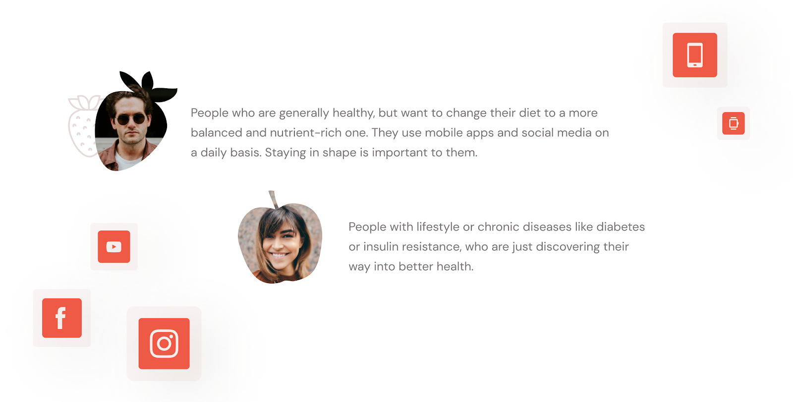 Personas we drafted after our research.
Our very own recipe (so what we wanted to achieve)
50g research, 1 cup wireframing, 2 tsp UI Design
The thorough analysis of products already on the market helped us to clarify and sharpen our product’s vision.
We aimed at creating a fully personalized application, able to educate people on the benefits of healthy eating while providing a variety of delicious plant-based recipes.
We wanted our app to be the user’s companion on their journey towards better health. A place where users can easily manage their meal plans and shopping lists on a daily basis.
Time to go shopping
When we had the UX recipe ready, we were able to break the app down into the most crucial ingredients and decide which functionalities we want to include so they serve the app’s main goals.
Defining components
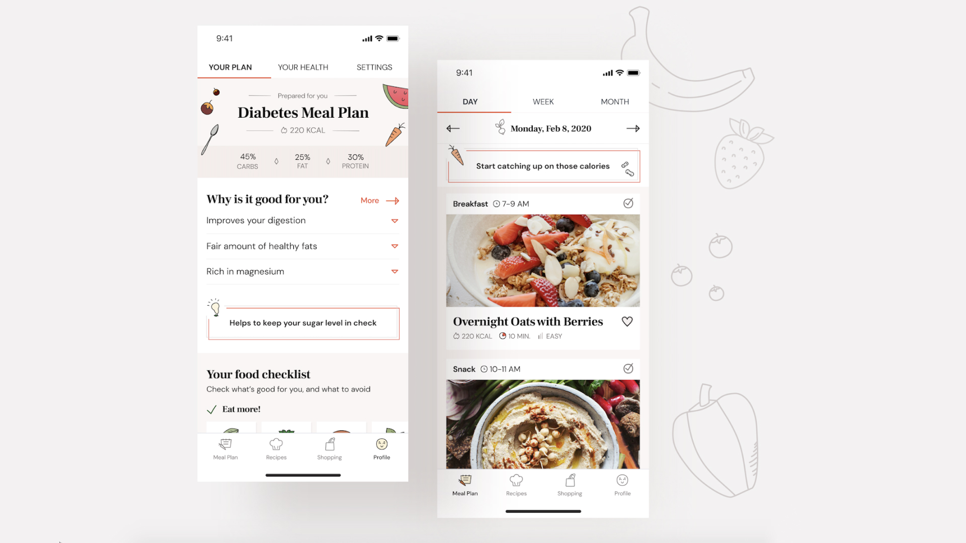
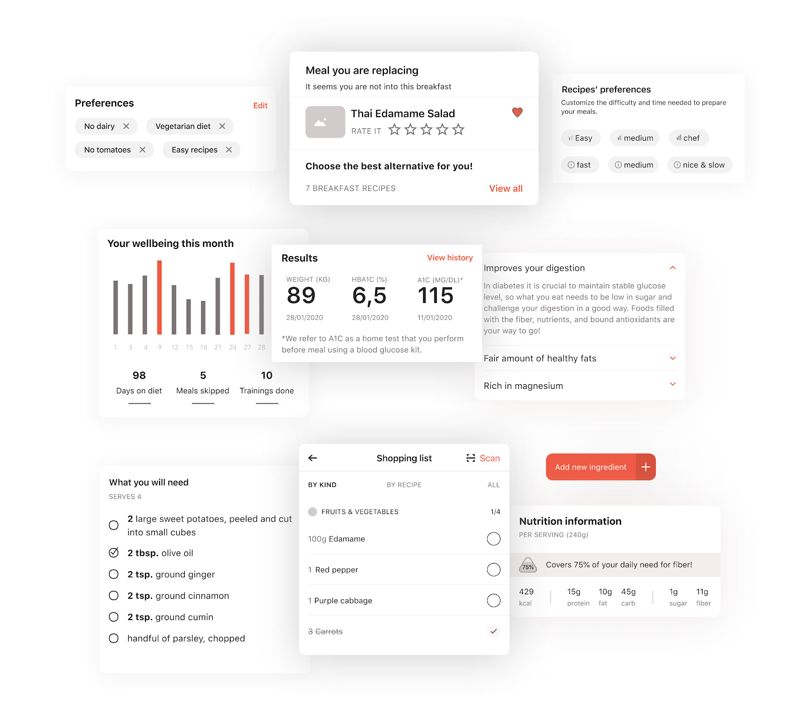
1. Fully personalized meal plans
It’s like visiting a dietitian — you define your favorite and least favorite foods and the app personalizes your meal plan to suit your taste. You can swap between meals depending on what you feel like eating. Because nobody knows whether they will prefer pancakes or sunny-side-ups for breakfast a week from now!
2. Nutrition advice
Depending on your goal, you can track your calories and nutrient intake. But apart from the data itself, the app will also provide you information on why this specific microelement is good for you.
3. Well-being tracker
Consistency is key. If we eat well for a week and the next, we mostly survive on takeout, the results will not be breathtaking. That’s why we added the tool to measure your progress so you can keep your spirits and motivation up.
 Main Healthy Meal app’s features
4. Shopping lists
So the user has already set his goal and chose the right meal plan. The motivation is there, but… his fridge is still a relic of his old habits. It’s time to go shopping. In order to make it easier, the app allows users to add ingredients from selected recipes to the shopping list.
5. Product search and scanner
Our app has a built-in scanner and search that not only gives you the nutrition information but also provides recommendations based on your health profile.
6. Cooking mode
The cooking mode was inspired by various car applications. When your hands are dirty and you need to look at your phone while preparing the meal, font size, big buttons, and voice commands can be incredibly helpful.
Combine Ingredients during UX Design Phase
This was the time when we had to combine all the components into bigger functional pieces. We tried to stick to the patterns that the user already knows from various apps, to make it user-friendly and intuitive.
Our experienced Chef (or actually, a User Experience designer) worked on this task, chopping, stirring and steaming until it started to look like an actual app. Guerilla testing was extremely helpful at this stage as it allowed us to maintain the right course.
 The Healthy Meal app’s screens during the wireframing phase.
Season the taste with some tasty Visual Design
We started defining the style of our app by choosing the right font combination. We wanted to go for the warm and inviting look that is a bit more classic and readable.
A good cook knows that there are not four but five basic tastes, and that it’s a must to add a little bit of umami to elevate the dish. In order to make the design stand out more, we added custom-made illustrations and served it with the flat design that reminds a cookbook style a bit.
 Fonts and styles of the Healthy meal app.
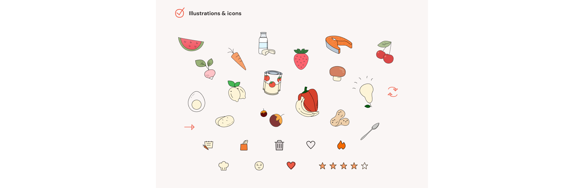 Some of the custom-made app illustrations.
Bon Apetit!
See final screens in our Behance case study.
Do you need help scoping your product?
We're available for new projects!
You may also like
The Cost of Waiting: How Refactoring Your Legacy App Prevents Massive Technical Debt in 2026
31 May 2026 • EL Passion

One Partner, Full Delivery: Why End-to-End Agencies Beat Fragmented Teams for Speed-to-Market
31 May 2026 • EL Passion
We’re available for new projects.
