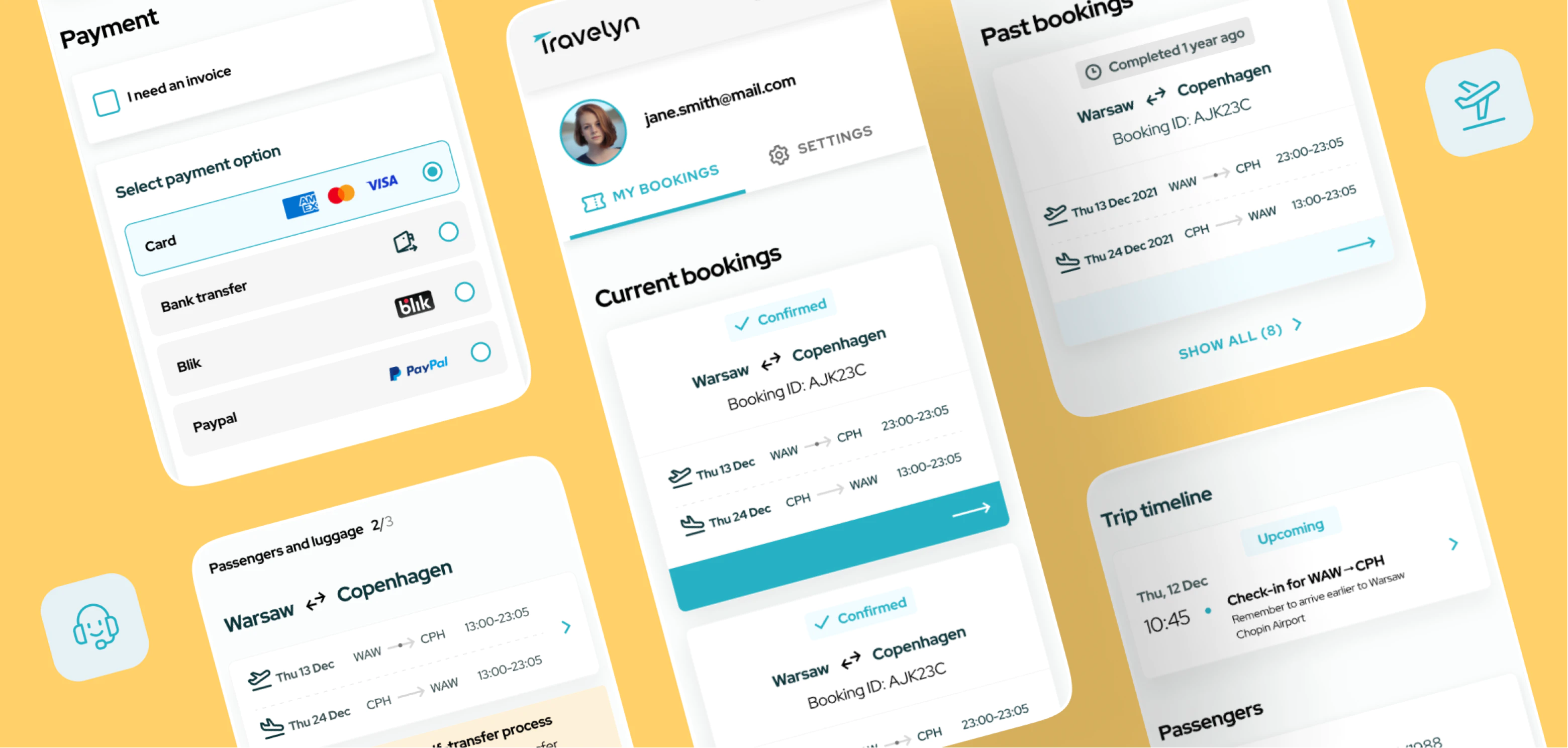
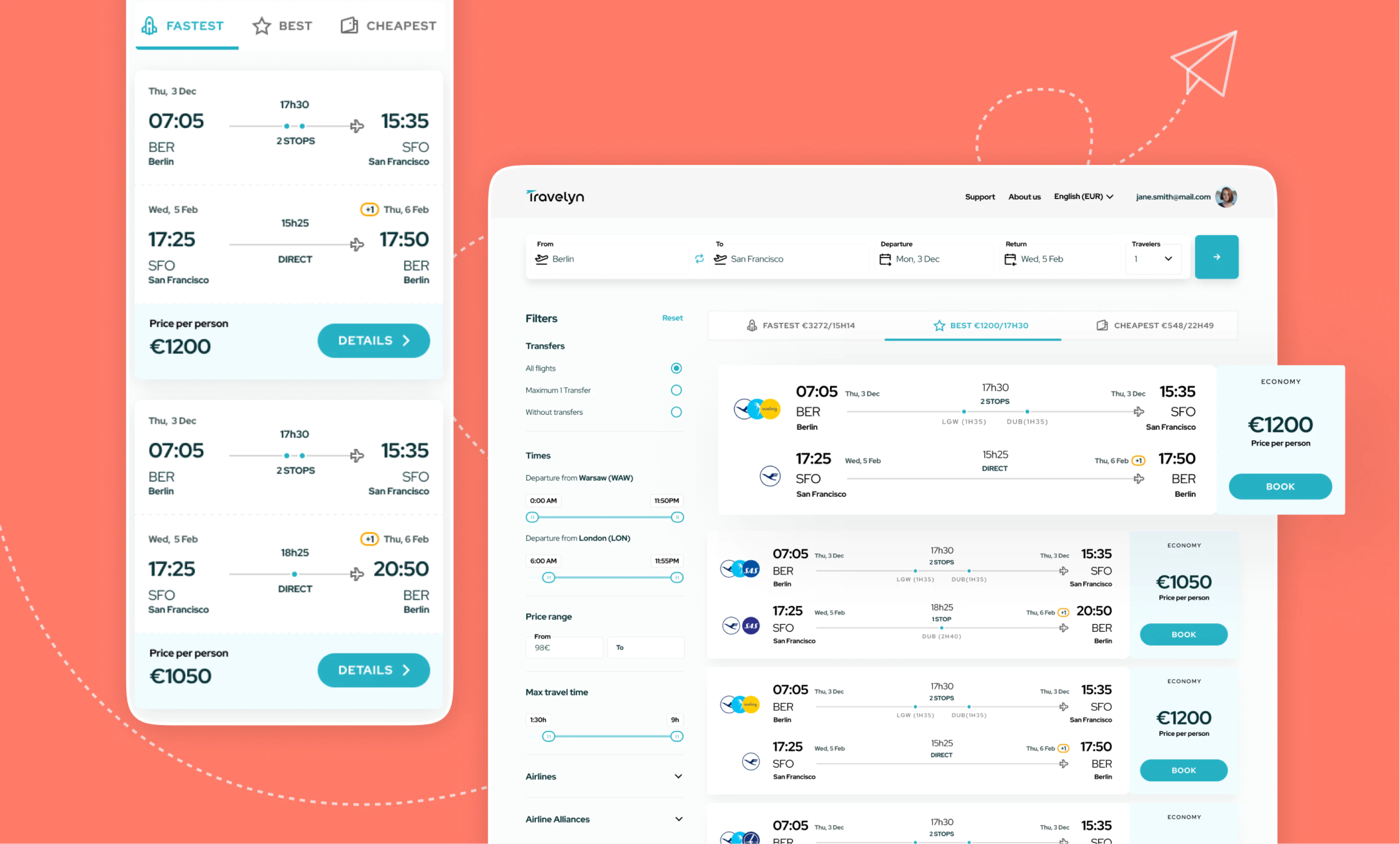
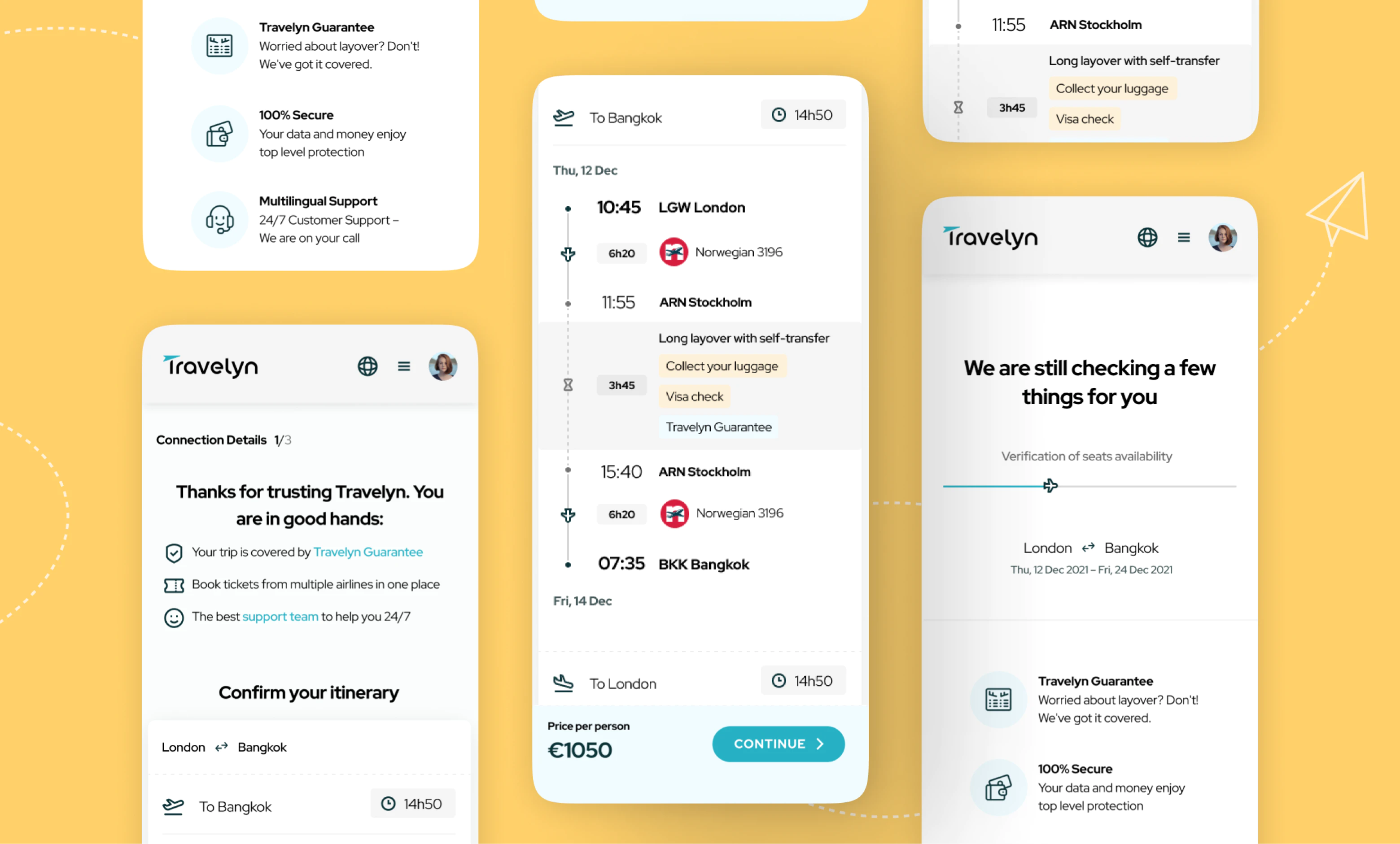
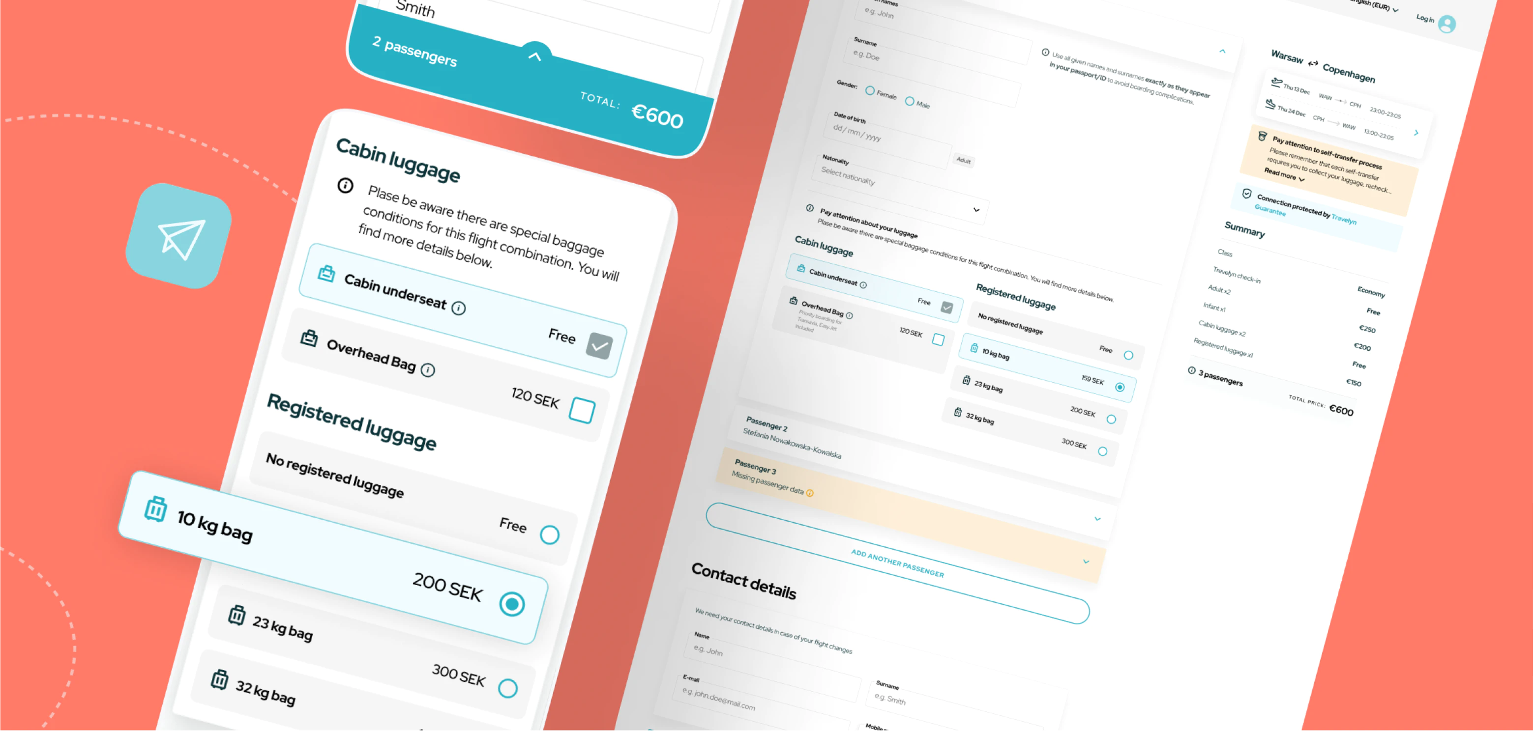
Travelyn-casestudy-desktop-header

Travelyn

Redesigning a flight search engine

Travelyn-white

Expertise

UX Audit, UX Strategy, 
UX & UI Design

Platforms

Web

Industry

Travel, Airlines

Travelyn is a flight search engine that allows users to create ‘impossible’ flight connections. Thanks to the Virtual Interlining process based on advanced algorithms, travelers can easily book airline connections, including carriers that do not normally cooperate.

Travelyn needed to reach UX excellence to satisfy thousands of customers worldwide.

travelyn-flightsearch@2x

Travelyn wanted to refresh their UX experience in order to improve their customers’ trust and satisfaction and thus, boost their conversion.

The client approached us with a list of challenges on how to enhance their existing user flows and an idea for a completely new feature — User Account aimed at building a long-lasting relationships with Travelyn users.

We offered them a holistic approach and proceeded with UX Audit and UX Strategy before delivering findings and proposing tangible solutions in order to achieve UX excellence.

travelyn-searchresults@2x

Users need clarity

Previously, seeing all the flight information in Travelyn’s search results might have caused some confusion for the user. After a thorough competitors analysis, we decided that the amount of information on the tiles should be limited and neatly organized.

Knowing that users need to feel confident before their decision of booking a flight, the key flow was changed. We made all the necessary connection details visible rightaway, so it’s more straightforward for the user, while giving them the option to explore further in the next screen.

The Call-to-action button was given a clear description, and of course, we didn't forget to introduce accessibility standards in fonts and colors.

First: we took care of the processes’ transparency and the product’s accessibility.

travelyn-tripplan@2x

Don’t make me wait or at least don’t let me notice that I’m waiting

Most Travelyn users arrive at their website from popular flight search engines. Until now, the first thing they saw was a loading screen as the tool was checking the flights’ availability in the background. This resulted in a relatively high percentage of dead clicks (an indicator of frustration or a failed expectation) – 31%.

Our solution was to manage the waiting time by presenting important information about the details of the journey. We also had to consider the corner case scenario of a prolonged wait for the system to respond and the need to show a loading screen. We designed a progress bar which, combined with changing messages, engages the user and assures the user that everything is moving in the right direction.

For 75% of the users that arrived at the Travelyn website, the loading screen was the first thing they saw. We couldn’t go around the wait time, but we could engage customers’ attention and make the wait unnoticeable.

travelyn-luggage@2x

Why are so few customers buying luggage? How do we encourage them to do so?

Why not to kill two birds with one stone?

Before, many users would overlook the ability to add luggage, because these options were somewhat hidden in the interface. They needed to be searched for and the semantic analysis showed us that the luggage instructions were not clear enough.

By introducing visible and well-described tiles, we managed to improve the user experience, but also to meet Travelyn’s business need — the luggage options available at one click made the purchase easier and more intuitive. No dark patterns included!

travelyn-theprocess@2x

Ensuring open and continuous communication with users

Before our redesign, some of the booking process views seemed identical to the users, not giving them affordance to move forward in the reservation. This resulted in doubts: “What stage of process am I at?”; “Did I fill in all the data properly?”.

As an answer to this problem, we designed compact views summarizing the steps completed so far and gave the user the ability to check flight details and passenger data at any time.

The redesigned stepper communicates the system status correctly, making good UX go hand in hand with business requirements.

Building a sense of confidence in the customer before making the crucial purchase decision.

travelyn-profile@2x

The final step of the redesign process

Travelyn needed to build their customer loyalty in order to achieve higher customer retention. This was one of the main intended effects of our redesign.
A User Account feature is opening up opportunities to create a more personalized service as well as add features improving their product’s user experience:

- My bookings section provides customer information about upcoming trip and gives insight into travel history,

- Trip timeline section helps users envison their upcoming journey in real time. It informs about all the upcoming steps to take, along with time & date, and how to prepare,

- Saved travelers functionality allows users to save and autofill data: your own and your fellow travelers. Booking becomes fast and effortless, and the probability of error when entering data is significantly reduced.

What's next? 

Our Design team supports the continuous development of Travelyn. Our audit and recommendations created a new vision for further product improvements and we can’t wait what the future brings.

Travelyn’s user account functionality is a great tool to encourage a long-lasting relationship between a customer and service provider.

Tools

  • Figma

    Figma

Deliverables

  • Benchmarks with a list of recommendations and industry best practices

  • Backlog with described and prioritized tasks

  • UX recommendations for future development of the product

  • Enhancement of UX and UI

  • Design Library adapted to accessibility standards

  • User Interface with full product documentation

Maybe it’s the beginning of a beautiful friendship?

We’re available for new projects.

Contact us