


Chapters

Learn about what web accessibility is, why it's important, and how to design and code websites that can be used by everyone.
It’s difficult to imagine today's world without the Internet. We’re used to websites working smoothly and when we encounter any bugs, we’re rather surprised. Still, bugs are relatively rare and usually, they don’t concern the apps’ key functionalities. And if they do occur, an alarm is raised immediately and the bug is removed in an instant. The situation is slightly different for a significant part of our society. People with disabilities and various other limitations (both physical, e.g. hearing or sight, and neurological) struggle with digital obstacles pretty much every day.
Although there are many solutions and practices currently available that enable increasing the level of applications’ availability and making it easier for such people to use the Internet in the most effective way possible, not all programmers and designers pay attention to this in their work, and some of them even have little awareness of their existence.
Web accessibility - what is it?
Web accessibility focuses on creating web applications in such a way that they’re accessible and therefore usable by the widest possible group of users, regardless of their limitations. W3C (World Wide Web Consortium) has created and continues to develop standards for creating applications in such a way as to best meet the challenges related to users' disabilities and other limitations leading to exclusion from using various websites. These limitations may concern vision, hearing, speech, and motor organs, and may also be related to neurological, cognitive, or even psychological disorders.
Accessibility is quite a broad concept - there’s no exhaustive list of absolutely all requirements that must be met to say that our app is "accessible".
Despite the existence of guidelines, there are often cases in which a solution turns out to be partially unavailable only at the stage of using the websites by users. If we want to live in a world where every person is cared for equally and people are not - as far as possible - deprived of access to goods that other people can use, it’s worth getting acquainted with the topic of web accessibility and changing a bit of an approach to your work. The best thing is that implementing activities ensuring accessibility doesn’t generate too much additional work for programmers or designers - it’s enough to familiarize themselves with existing solutions and follow specific standards and rules when creating web applications. So it's a bit of an effort to get started, but the benefits for the world are immeasurable!
Accessibility standards
There are organizations that create guidelines for creating accessible websites. WAI, i.e. Web Accessibility Initiative, has created the most known of them, including:
- WCAG (Web Content Accessibility Guidelines), which contains information on coding in such a way that individual elements of a website, its structure and the solutions used on it are accessible to as many people as possible
- UAAG (User Agent Accessibility Guidelines) with guidelines on the accessibility of user agents (browsers, extensions, media players, readers, etc.)
- ATAG (Authoring Tool Accessibility Guidelines) contains guidelines on what requirements authoring tools should meet - in this case, the point is that no matter how good intentions the website creator has, he or she will not be able to undertake activities that are impossible to achieve when a given tool (e.g. no-code tools for creating websites) does not enable the use of accessible practices. The problem is that they are often very difficult and generate higher costs due to the extended time needed to implement them.
Law in the fight for accessibility
Digital accessibility is not just a concept - it’s also protected by law. People with disabilities have the right to access information and communication technologies at the same level as other users. This is to ensure their independence and prevent social and professional exclusion.
According to Art. 26 of the Charter of Fundamental Rights of the European Union: Integration of persons with disabilities: "The Union recognizes and respects the right of persons with disabilities to benefit from measures designed to ensure their independence, social and occupational integration and participation in the life of the community." Article 9 of the United Nations Convention on the Rights of Persons with Disabilities (UNCRPD) also contains a provision on the obligation of EU members and the EU itself to take action to ensure the greatest possible inclusiveness in access to information and communication technologies, including websites. In 2016, The Web Accessibility Directive also came into force.
One of the next steps aimed at increasing digital accessibility is The European Accessibility Act - an EU directive from 2019, regarding the availability of digital products and services - not only the Internet, but also other software and hardware, e.g. devices such as ticket machines and ATMs. The directive will apply to entrepreneurs from mid-2025. It indicates the direction in which we should move to systematically achieve and increase accessibility. It doesn’t contain specific principles, practices or tools to be used. In terms of website accessibility, the directive largely overlaps with the WCAG 2.1 standard (Web Content Accessibility Guidelines).
Web accessibility development - for whom to strive
Access to information and communication technologies is defined as one of the fundamental human rights in the UN CRPD (the United Nations Convention on the Rights of Persons with Disabilities). Nowadays, the Internet is one of the main channels of interpersonal interactions and replaces many real-world services (e.g. healthcare) and is itself a way to increase the availability of goods for people with limitations that would be virtually impossible without the Internet, e.g. access to book content for a person who can’t go to the library or store due to illness, the possibility of shopping for immobile people, access to newspapers for the blind, the possibility of taking part in a discussion for non-speaking people. Therefore, unlimited access to Internet content becomes extremely important. Depriving or limiting the ability to use the Internet may cause social exclusion and lead to a feeling of injustice and maladjustment in the world.
Usually, when we think about activities related to accessibility, we assume that they’re aimed at people with various disabilities - vision, hearing, or movement disorders. It’s a bit less obvious that such activities should also be addressed to people with intellectual disabilities or neurological disorders who need various types of support in receiving information. However, the list of people who can benefit from high-availability work does not end here.
When designing and writing applications, it’s worth broadening the perception of the topic of accessibility - it doesn't only concern limitations related to the physical nature of a given person and problems are not limited only to permanent ones, but also include temporary situations in which people find themselves. Therefore, the target will also be people with temporary mobility limitations (e.g. a broken arm), people who for some reason can’t read or write, but also e.g. people forced to use the Internet in unfavorable conditions, such as noise, broken speakers or mouse, bright light, weak monitor, and many others.
Let's take transcriptions as an example. Their default target group is primarily deaf people. But in real life, they will also be used by people with partial hearing impairments, e.g. elderly people who can hear but not clearly and thus need to support themselves. If we go even further, such subtitles will also be useful for anyone who is in a noisy room, doesn’t have access to working speakers, or can’t turn on the sound because, for example, they’re watching a movie hidden under a desk during a lecture (we don’t judge you).
The same applies, for example, to attention to visual issues such as contrast or the appropriate size of elements - this will be useful for the visually impaired, but also for people in bright places when the screen is less clear. Programs that can be operated only with one hand (e.g. a touch screen at the checkout in a store) that are adapted for people missing one limb will also be operated by a person with an arm in a cast or a mother holding a child. Taking care to use images that are not too large will be important for people who don’t have access to a high-speed connection. The ability to use a screen reader will be useful not only for the blind and visually impaired, but also for people with cognitive disorders who have difficulty reading written text. And so on.
When creating websites, it’s worth maintaining good practices and attention to accessibility, thanks to which we’ll obtain increased accessibility, which can be useful in various situations for virtually every user of our application. And it’s worth noting here that this applies not only to applications displayed on computers, but also on smartphones, watches, TVs, and other devices with their own software.
You can also look at accessibility from a different perspective - the benefits resulting from taking care of it are not limited only to website users. Their owners will also benefit from the fact that they are able to expand their target group to include people who, if neglected in this matter, wouldn’t be able to learn about the content they expose to the world.
Making a website accessible - technology to help
In today's world, there are many solutions to help solve accessibility problems. These include assistive technologies and adaptive strategies. The former are hardware and software designed to make it easier for people with various limitations to use the devices. These include:
- screen readers - programs that read the content of the page. They have a built-in option to navigate through specific elements, such as headers, buttons, links, inputs, texts, lists, and alt texts for images or videos. When the reader encounters an element, it reads its name, role, and status. E.g. If it hits a checkbox, it will read something like "I agree, checkbox, checked". Messages from individual screen readers may differ slightly,
- microphones for vocal data entry with limited manual dexterity or missing limbs,
- software enabling website navigation on mobile devices by swiping in different directions or rotation (used by blind and visually impaired people in conjunction with a screen reader),
- refreshable braille display - special hardware that dynamically displays text on an ongoing basis using multiple pins (and is the only option for people who suffer from vision and hearing disorders at the same time). It’s available in both a more stationary and portable version, via Bluetooth, so you can use it practically anywhere,
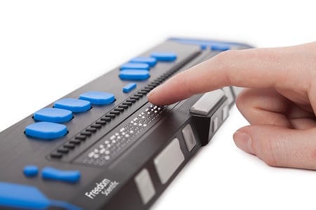 Refreshable Braille Display
- single or multiple button switches usually operated with the hand, foot, or head,
- camera switches based on head movements,
- eye tracking, which allows you to navigate the application based on eye movements,
- speech recognition software that converts spoken language into text, usually used by people with mobility disorders or missing limbs,
- sip-and-puff switches that enable tabbing and clicking by sipping and puffing into a straw
- and others
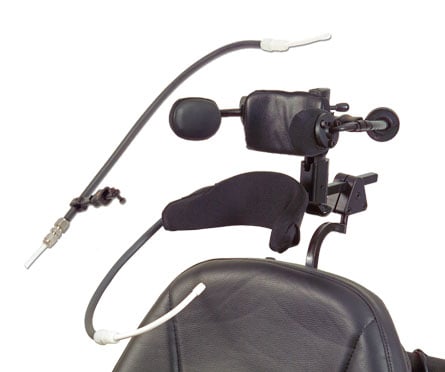 Sip-and-puff switch
When it comes to adaptive strategies, these are techniques used by people with limitations to make it easier to use the application. An example is customizing the browser's operating system settings - changing the font size, spacing between characters, switching to high contrast mode, using the keyboard or joystick instead of the mouse (but this again requires a well-coded website), or simply enlarging the content. This applies to both desktop and mobile devices.
How to create accessible websites?
Today's world offers many conveniences and facilities for people with various limitations. These include solutions that help with the problems of individual sensory and movement organs, as well as hardware and infrastructure limitations. Below I present selected popular practices related to accessibility, the implementation of which is straightforward and requires, above all, good intentions.
Well-thought-out naming is invaluable
One of the most popular technological solutions related to accessibility is screen readers. They read the content of the page aloud, offering the ability to choose the language (differences in accent) and set the reading speed. They are used by people with visual impairments, but also by cognitive disorders, for whom receiving content in the form of sound is much easier than in the form of text. For users of screen readers, it’s especially important to remember that important elements have text descriptions or labels. This applies to elements such as headings, buttons, links, lists, tables, images, videos, controls, and inputs. The screen reader will tell you that a given type of element exists in a given place on the page, but a user who can’t see it will be of little use, for example, the information "button" without additional information about what it does. If we add a text description or an “aria-label” attribute to such a button, e.g. “confirm” (you can read about aria attributes later in the article), the screen reader will read “button, confirm”, which is a more understandable message. But… is it really enough?
While for a sighted person, the "confirm" button under the form is a clear enough message, for a person who does not have access to the visual part of the message, it may not be enough to determine whether it’s, e.g., about confirming age, one selected option or the entire form. Therefore, it’s worth providing screen reader users with precise descriptions of elements, such as (in our example) "Confirm address form". The same applies to naming links so that it’s clear where they lead e.g., the often-used "read more", which may also appear in many different places on the page, will not be sufficient information for a person who does not see what such a link is about. It should have a label or aria-label like “read more about some content”. On the other hand, you can’t be overly descriptive, as too long texts will slow down website navigation.
However, using appropriate names is important not only from the perspective of visually impaired people but also from the perspective of all other users. In particular, text descriptions of all significant and action-leading elements, such as buttons, controls, and images, should be clear and understandable, and if this type of element does not have visible text, it must be ensured that it’s sufficiently understandable in itself.
Not just written text
A practice that isn’t necessary (because it’s provided by screen readers), but influences the quality of content reception by users, is to provide an audio version of the written text in the case of longer content, such as articles on a magazine's website. Providing a voice-over is not necessary, because the text can also be read by an automatic machine, but the impression is different when the program reads and when a real person understands the content of the message and modulates the message with his or her voice. Moreover, some visually impaired people (e.g. elderly people) may not even be aware of the existence of assistive technologies. The ability to press the "listen" button and listen to, e.g., an online newspaper article read by a narrator will allow them to reduce the feeling of helplessness or dependence on other people.
Take care of images
The pages contain various types of visual content, such as images, icons, and videos. However, not all of them are adapted to adaptive strategies, such as enlarging the page content by zooming. If the image on the website is not a vector or its resolution is too low, it can’t be enlarged while maintaining the appropriate quality.
Another problem occurs when, for some reason, the images are not displayed and we include important text on them (instead of adding it in text form) or, even worse, we use, for example, an image as a button. Such elements will not be displayed at all and the user may not be aware of their existence.
This may be the result of a too-weak connection, opting out of downloading images in the settings to save transfer, or, for example, not displaying background images in high contrast mode.
In a world without mice
One of the most common practices related to accessibility is adapting pages to allow full site navigation only using a keyboard or joystick. This is especially important for people with limited manual dexterity, but also for those who, for some reason, don’t have access to a working mouse or touchpad. Navigation using the keyboard is mainly done using keys such as Tab, Shift, Space, various arrows, and Esc. They allow you to jump over focusable elements (that's, among others, why it's so important to use the correct semantic tags), select them, and click on them.
Adapting a website to keyboard accessibility is not limited only to the ability to focus. It’s also important in what order the elements are focused - above all, whether the order is clear and logical from the user's point of view. Individual page elements that are logically connected should be focused in the appropriate order, e.g. navigation first, then the main content, and finally the footer. You also need to be careful whether the focused effects have a visible focus state, without which it’s impossible to know where you are on the page. So you should never set the property outline to none!
.png?width=300&height=504&name=image%20(6).png) Example of a menu item marked by the outline
Example of a menu item marked by the outline
One of the practices that improve the user experience is the possibility of skipping links, e.g. creating a hidden button called "go to main content", which appears only after focusing on it using the Tab key. Thanks to it, you can skip some of the page elements (such as navigation) requiring multiple clicks.
You should also remember to add the ability to select scrollable elements - if you won't do this, the person using the keyboard will lose the ability to access their content.
It’s also worth remembering to pay special attention to enabling focusing elements if our website displays modals. If we can’t navigate to its content using Tab, e.g. to accept cookies, and the focus will only take place under the modal, we are deprived of the ability to use the given website. The same applies to modals opened using a button - sometimes when a modal is opened, the focus is not directed to it and to get to it, the user has to go through the entire page content.
Unfortunately, despite the ease of implementation in code, many websites still have many problems in terms of keyboard operation.
Semantic tags are not an unnecessary whim
The use of proper semantic tags is often underestimated. Perhaps this is due to the fact that some of them (such as main or nav) were introduced relatively recently and the same-looking page can be written using basic tags, like div or p. However, the thoughtful use of semantic tags brings specific benefits - one of them is that screen readers can distinguish them. For example, we can create a bulleted list using divs, paragraphs, and spans, but if we use the appropriate <ul> and <li> tags, the reader will say something like "list of three items, bullet, <content>, bullet, <content>", and finally "list end".
It’s worth mentioning that since readers are operated only via the keyboard, it’s extremely important that individual significant elements are accessible from the keyboard in the right order. Using appropriate tags allows the user to navigate through specific elements.
Tags for headings, lists, forms, and tables are also particularly important. In the case of headings, you should ensure their correct hierarchy, creating the structure of the page. The reader reads the heading along with its level and content, e.g. "Heading level 2, heading content". This not only allows you to better understand the subject of a given part of the website but also to navigate it more efficiently. A common mistake is to use headings out of order, e.g. only <h1> and <h4> tags, omitting <h2> and <h3>. This usually happens because the coder relies on the default font size instead of its semantic meaning.
Page layout and text formatting
In today's world, creating responsive websites is rather obvious. This makes it easier to navigate through websites and eliminates the need to constantly scroll sideways. However, this often doesn’t take into account the fact that people with various disabilities use various methods to modify the visual part of the website. Visually impaired people often change the size of the entire page using the zoom function (Cmd/Ctrl with +), or change the font size, color or spacing settings in browsers to increase the readability of the text. If the page is not written well, it can cause practical problems such as parts being cut off or text overlapping. Basically, it can be said that the better a website is written, the more it allows the user to adapt it to their needs (size, spacing, fonts, colors).
If enlarging the text or the entire screen causes problems, it means that something is wrong with the code. It’s worth noting that blocking the zoom option is not an optimal solution here - instead, it’s worth avoiding, e.g., position: fixed, which may cause the element to be outside the scope of the screen when the content of the page is enlarged. You also need to be careful about elements that appear only when hovering (e.g. tooltips), which may disappear in an area off the screen if the user uses zoom and they will be cut off or even displayed entirely outside the visible area of the screen and the user will not know about them. Another important thing to note in this context is that permanent page elements (e.g. navigation, logo with a link to the home page) should be where they are usually placed (i.e. at the top or on the left side) so that people zooming in website, could easy find them once they were outside the screen.
It’s also worth remembering that the text in individual blocks should wrap. Thanks to this, even if we enlarge the font several times, the width of the line won’t increase and there will be no need to scroll the text sideways, which significantly increases the time and reduces the comfort of reading. For some people with cognitive disorders, the ability to see the entire text at once is crucial when it comes to the ease of its reception.
 Text without wrapping
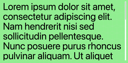 Text with wrapping
The next very important thing is to use appropriate size units. You should never use fixed values expressed in pixels - the appropriate alternatives are relative units such as rems, ems or percentages, which adapt to the user's settings. Browsers usually have a default value of 1rem set to 16px (so font-size:100% will mean 16px here because it’s 100% of the selected default size). It’s possible to change this type of setting unless we set the dimensions rigidly in pixels - then we’ll permanently overwrite the user’s preferences. If the page is written using relative units, what matters most is the proportions, and changing the size of the entire font may be trivial and limited to changing the root font size.
In a world without colors
There’s nothing wrong with the fact that when designing websites, designers choose colors not only for visual but also for functional reasons. The red color is, for example, used to signal errors and warnings, green is usually seen on acceptance buttons, etc. However, we can’t forget that a (quite large) part of people struggle with color perception disorders. Therefore, we have to remember that if we convey any information on our website only through color, it will be practically useless for them, and in such a situation additional information in the form of text or very direct graphic symbols should be provided. For example, just highlighting the input border in red in the event of an error will be practically useless for colorblind people. Just like highlighting a link in color without otherwise distinguishing it from the text will make it invisible to them. Problems may also occur if, for example, charts or graphs have a legend consisting only of colors.
It doesn't matter if it's nice, it's important if it's clear
When designing websites, you should focus not only on their visual attractiveness, but also on usability - people with visual impairments will not appreciate beautiful white inscriptions on a light pink, pastel background, but they will certainly be grateful for the colors that will enable them to see the letters on the background.
Too little contrast is a problem not only for visually impaired people but also for people with cognitive disorders or simply using devices in too bright places, e.g. outdoors on a sunny day.
High contrast mode comes to the rescue here - it can be automatically turned on, e.g. on Windows devices. However, if we want to treat all recipients of our website equally, we should try to create designs that take into account the minimum level of contrast required by the standards (this can be checked in accessibility measurement tools, e.g. in the storybook accessibility tab) or, if it’s not possible, design a second, contrasting version of the website and enable switching between them.
It’s also worth mentioning dark mode here. Theoretically, it can be achieved automatically, but if we want to really take care of our recipients, we should also provide them with a good quality, carefully designed dark mode of our website.
When the picture is everything
The above tactics concerned primarily the problems of people who had problems with their eyesight or the quality of the displayed image. People with hearing limitations face other problems - and here again, it’s worth noting that while solving the problems of the deaf and hard of hearing, we also address the problems of people with non-functioning speakers or in noisy environments. There are slightly fewer problems here because the entire visual part of the website is available to such people - the problem occurs when audio elements are added to the website. The most obvious solution to this issue is adding subtitles and transcriptions. Their absence completely prevents many people from receiving content containing audio.
Captions are the most convenient option for a video when you want to focus on it and just be able to understand what’s being said. They allow people who are deaf or hard of hearing to watch movies, but also those who are in noisy rooms or in situations where they can’t increase the volume, or those whose speakers are broken. Captions also often contain descriptions of the sounds and music appearing in a given video. Unlike transcriptions, they benefit people who lip-read and provide real-time assistance. In addition to the existence of captions, it’s important to ensure that they’re legible - large enough (preferably with the ability to set the size), contrasting with the background and written in a clear, preferably sans-serif font - after all, it sometimes happens that someone who needs subtitles may also have problems with sight. The same applies to the subtitle switch or the play/pause button, etc. - they should be visible enough and preferably displayed on top (and not in the submenu). Although tools for automatically generating transcriptions exist, their use may be associated with inconvenience in the form of content errors (especially when the person "translated" has not very good pronunciation) and the fact that in this case, we have no influence on visual aspects of displayed text.
Thanks to the possibility of obtaining a transcription of some material containing audio, we can in some situations refrain from downloading a sound or video file and thus save transfer costs. Transcriptions also allow for efficient translation into Braille. And reading a text is simply much faster than watching a movie, so you can read the content you wouldn't have time for otherwise.
Any type of text form will also be helpful for people who receive content in a non-native language (when written language is easier to understand than spoken). An additional, but more work-intensive solution is to add sign language translation.
It’s also worth paying attention to whether any functions will be unavailable to users with a given limitation - in the case of deaf people if in the "contact" tab we provide only a telephone number to which it’s not possible to send a text message, they won’t be able to contact us - in such a case, you should also include an e-mail address, a contact form or, for example, some kind of chat on the website.
Website with accessibility features. -the simpler the better
It must be remembered that the users of Internet portals are various people, and their limitations are not limited only to the sense organs and the musculoskeletal system. They are also related to cognitive disorders and intellectual disabilities. People suffering from any of them have various types of problems in receiving content, including those posted on the Internet.
For example, some people may have problems with understanding written text - they will also find transcriptions useful if they find audio content easier to understand. Difficulties in such a case also include any "squiggles" that make the font more beautiful (which, by the way, is also a hindrance for visually impaired people) or procedures such as text justification (uneven spacing can be distracting), which should especially not be used for lines containing few characters (larger differences between the width of the spaces between words).
It’s also worth taking care of things such as clear - preferably as standard - navigation, not using too long, complex sentences when it’s not necessary (I’m not talking about the content of longer texts such as articles or blog posts, but more about the elements necessary to operate the website, instructions, regulations, etc.).
Particular attention should be paid to the design of elements such as forms and other types of elements with which the user interacts - for example, a placeholder in the input should never replace a label because after entering something, we have no way to check whether we have entered the item in the right place.
Don't require precision
It sometimes happens that, in order to cram as much content as possible onto the page, we increasingly shrink individual elements to fit them on the screen. This (but also simple inattention) may result in elements that are too small and with too small spaces between them. In addition to the difficulties in receiving such content, there’s also the problem of ease of use of the website, especially on mobile devices with touchscreens. People with motor dysfunctions, reduced manual dexterity, trembling hands and in fact, even people without disabilities, may have trouble hitting small elements - this may cause problems with getting to the desired element or, worse still, clicking on other elements unintentionally and triggering unwanted actions on the page, which may be very frustrating.
When designing a website, let's ensure the appropriate minimum size of focusable elements, reasonable spacing between them, and avoid difficult-to-use elements, such as a pop-up submenu on hover, which disappears when we accidentally move the cursor away from it.
 Icons too close to each other
![]() Icons with enough space between each other
Icons with enough space between each other
Keep your accent
There are things that can be achieved with very little effort, but for various reasons are not implemented. Sometimes it results from ignorance, sometimes from misunderstanding how such small inconveniences affect the quality of life of people who use assistive technologies. One of these things is the skillful use of the lang attribute. In most cases, you end up adding it only in the parent html tag. When setting the language of a website, we usually think about search engines, but it’s also important information for tools such as Google's Translate API or screen readers that read the text with the appropriate accent. And here comes the problem of quotations - sometimes we quote something in a different language than the language of the rest of the page. In such a case, it’s worth setting the lang attribute for a specific div or paragraph - thanks to this, screen readers will read them with an accent different from the rest of the text.
Additionally, it also allows browsers to correctly display characters found in given languages, and gives the opportunity to set specific CSS styles for texts in a given language using lang pseudo-class:
Don’t move too much
There are aspects that we don’t even take into account when creating websites because they are difficult to come up with. One of them is the issue of animation on the website - people with cognitive disorders, learning disabilities, and low vision may perceive animation as a big problem and distraction in the reception of content.
The most problematic are elements such as full-page banners, moving backgrounds, videos with autoplay that can’t be turned off, or even carousels that jump every few seconds without a stop option or with barely visible buttons to turn off their movement. However, if we really need to use an animation or a self-playing video, remember to add a button to it that allows the user to pause or mute the animation.
Think twice before using Captcha
There are many websites where, when confirming some data, we encounter a captcha to make sure that there’s a real human being in front of the screen. This security is visual - it’s a task of e.g. reading deformed text, and selecting from several images only those that meet the required criteria. It’s not difficult to guess what happens in the case of a blind or visually impaired person - if there’s no one to help him, such person is deprived of the opportunity to use the given functionality of the website. Assuming that we don’t want to be the creators of solutions that exclude part of society, we should avoid solutions such as captcha.

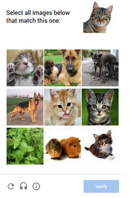 Examples of captcha
Nevertheless, CAPTCHA is allowed by WCAG (Web Content Accessibility Guidelines), but under a few conditions. An Accessible CAPTCHA must be in a form that is accessible for use in various ways, covering different types of sensory perception (there may be variants to choose from) and have a precise description of the task of which it consists.
One of the best solutions at the moment is Google's reCAPTCHA v2 in the form of a checkbox with the label "I’m not a robot" - it’s a form without visual content, with a description, and what’s really important: accessible from the keyboard. In the case of this option, Google measures also e.g. naturalness of navigating the website and checks the IP address, or the number of requests sent from a given device. This seems to be an ideal solution, but if something seems suspicious, unfortunately, a picture CAPTCHA version appears, so this solution is also not without its flaws.
 Example of accessible captcha
There is also a newer Google reCaptcha v3 offering another solution - it verifies user actions on the website related to the Javascript API, but again - it still might not work ideally sometimes.
An alternative to reCAPTCHA is hCaptcha, which requires logging in to the hCaptcha page once every 24 hours to generate a special cookie. However, the limiting factor here may be the fact that hCaptcha requires an e-mail address, so you can’t remain completely anonymous.
How to make a website more accessible - HTML tag attributes
Using appropriate attributes is one of the main tools for increasing accessibility level through code. In addition to attributes such as role or alt, the most important in this context are ARIA attributes. The abbreviation for ARIA is "Accessible Rich Internet Applications". These attributes help make standard HTML elements more accessible to people with various limitations and who use assistive technology. They change, for example, the visibility of elements for screen readers. All aria attributes start with "aria-". Below are examples of attributes often used in the process of increasing accessibility:
aria-label
It happens that for some reason the design doesn’t assume the use of visible labels for inputs, a button or link is visually only an icon or image and doesn’t have text on it, or the text is not clear enough when separated from the design - in such cases, the purpose of such elements for screen readers users will be unclear. Let’s think about an icon button with a link - the reader can either read the href, say something like "visited/unvisited link" or inform the user about the existence of an icon. This is obviously not optimal UX. In this case, the solution is to use the aria-label attribute. It allows you to add a label that won’t be visible but will be read and could allow the reader user to understand what the element to which this tag has been added is used for.
aria-labelledby
This tag is used to mark text describing a given element, e.g. when an image has a visible caption and the alt is unnecessary because we do not want the text to be duplicated in two places in the code. In such a case, we add an id to the text element containing the description, and we add an aria-labelledby tag with the same id to the element (img tag) that it describes. Thanks to this, if we change the displayed image description, its description read by screen readers will also change.
aria-hidden
Adding the aria-hidden tag to an element makes it invisible to screen readers. Why hide something from users? This is useful, for example, in situations when our button or link is graphic and consists only or partially, e.g. of an icon. Some readers will automatically inform the user about the existence of such an element, and the words "path", "triangle", etc. may be reproduced. Adding aria-hidden to the icon will avoid this.
Another situation where aria-hidden will come in handy is when hiding elements. If we use display:none, the element will actually be hidden both visually and for readers. But if we use, for example, "opacity: 0", position: absolute with a location somewhere beyond the screen, or a low "z-index" hiding a given element, then as long as the element is hidden in the graphical sense, it will still exist for the reader. Then the solution to the problem will be to add the aria-hidden tag to such a tag.
aria-expanded
Informs the user whether a given element that can be expanded and collapsed is currently open. You can use it e.g. in the code of a "burger" menu.
role
This is not an attribute with the “aria-” prefix, but it’s definitely very important in the context of accessibility. It specifies what an element does in a semantic sense. If, for example, img is used as a button, we can assign it the button role. The benefit in this case will be that readers will still notice the "alt" tag (which would be omitted if the <button> tag was used), but this element will be treated as a button, so it will be also read as "button" and the user will know that they can click on it. However, you should remember to add tabindex={0} so that it can always be navigated using the "Tab" key.
alt
The alt attribute is an attribute of the <img> tag. It allows you to add a description to an image to enable blind and visually impaired people to understand what it presents. An additional benefit is that it’s also taken into account by search engines.
Not so long ago, Facebook introduced the generation of descriptions for images, which caused many mocking comments such as "what stupidity, I can see what is in the photo!" However, this function was introduced, among other things, to improve the experience of people for whom the perception of the image is somehow disturbed.
title
This is an attribute with a similar purpose to alt, but it can be used the same way for the video tag.
There are many more aria-attributes - it’s impossible to include them all here, however, I encourage you to read their list and applications that you can find e.g. here.
How do I know if my website is accessible enough?
If you’re wondering whether the website you’re creating meets accessibility standards and is free from other problems that make it difficult for certain groups of users to use it, you can measure the level of website accessibility using many of the existing tools specifically designed for this purpose, e.g.: SiteImprove Website Accessibility Checker or WAVE Web Accessibility Evaluation Tools. They are used by both programmers, testers, and designers.
These types of programs are able to check, to some extent, whether the website meets the guidelines established, for example, by WAI. They check the quality of the code in terms of accessibility and its readability for assistive technologies. If something is wrong, they’re able to let you know where the problem is and often even suggest a way to solve it. Such tools are also part of other popular tools used by developers, such as Lighthouse from Google or Storybook. However, it must be remembered that their method of operation has many limitations and nothing can replace manual testing, preferably by people who struggle with problems resulting from their various limitations on a daily basis. For example, such a program is able to detect the absence of a label in the input, but it will not check whether a given label provides a clear enough explanation of what a given element is for.
You can also support your work by using tools such as screen readers by yourself. Free options include, e.g.: Screen Reader Chrome Plugin or NVDA Screen Reader.
Digital accessibility - sources of knowledge
There are many websites, articles, books, and courses devoted to online accessibility, but I chose a few sample sources that made it easier for me to learn more about this topic. Here they are:
- “Web accessibility introduction” course by edX - an introductory course on web accessibility. The course includes, among others: many video materials in which "real people" show the challenges they have to face every day,
- the book “Inclusive Design Patterns” by Heydon Pickering, in which you can find many solutions to accessibility problems. Pickering focuses primarily on issues related to coding, but there are also fragments about design itself,
- the book "Mismatch" by Kat Holmes - it doesn’t contain practical knowledge about website design or programming, but in a unique way it introduces the reader to the topic of accessibility and exclusion caused by poorly thought-out design,
- WAI W3C standards:
Who should take responsibility for all this?
Having a general idea of what actions can be taken to increase the accessibility of websites, we can draw the conclusion that most of the responsibility here lies with the developers themselves because the operation of websites results primarily from the code that creates them. This can’t be denied, and their commitment to following best practices and technologies that increase accessibility is the key here.
However, other people also make a significant contribution. Designers decide, among others, about colors, contrast, size, and arrangement of elements. UX specialists influence what experiences users will encounter and what potential difficulties they may have. Product owners make sure (or at least they should make sure) that their product is addressed to as many recipients as possible. Content creators are responsible for providing content that is accessible to people with various disorders. And for sure, in this context, we can’t overestimate the contribution of testers, who are the only ones able to check whether the website is actually accessible - only they can (at least for today) assess whether the website is actually understandable to people with various types of limitations. It’s best if the testers are people who actually have some real limitations, and not if they are only aware of them.
The joint efforts and actions of the above people interpenetrate and create synergy, which significantly increases the chance of avoiding a situation in which someone, for some reason, is unable to gain access to the content or functionality of a website and may thus be excluded and deprived of using some parts of the website to which other people have free access.
Summary
As you can see, the topic of accessibility is incredibly broad - it’s impossible to cover it in one (although quite long) article and in order to fully understand it and acquire the knowledge to create accessible websites, it’s worth reaching for many different sources and talking to people who struggle on a daily basis, dealing with exclusion on the Internet. It may require some effort, but its effects will be invaluable in terms of creating a world in which everyone has equal opportunities.
Check out also:
- How to Avoid Design Debt — The Compound Effect of Good Design - 4 ways to avoid and minimize your organization’s design debt
- UX Review 101 — How to Review User Experience of Your Website - Learn the why, how, and what of conducting a UX expert review.
You may also like
The Cost of Waiting: How Refactoring Your Legacy App Prevents Massive Technical Debt in 2026
31 May 2026 • EL Passion
One Partner, Full Delivery: Why End-to-End Agencies Beat Fragmented Teams for Speed-to-Market
31 May 2026 • EL Passion
We’re available for new projects.
