


Chapters

Good design is based on a good copy. That’s why UX writing should definitely be the next thing on your skill set.
Should designers…
If you work in the design industry, you might have read at least one article starting with the following words: should designers [name the skill here]? This question returns to us like a boomerang, bringing a new thing each time. Should designers code? Should they know how to create breathtaking UI? Should they conduct research and client workshops? What about analytics? The list goes on and on.
As a response to this phenomenon, we see that many fractions have emerged in the design community. From specialization fanatics to one-man-army believers. Recently, the newest skill on everyone’s mind is writing. UX writing, to be specific. So, should designers write?
FOLI — the fear of lorem ipsum
In 2019 everyone (sic!) knows, that lorem ipsum is bad. If you use lorem ipsum, it is because you either believe that content is not your responsibility, or you are too busy (lazy) to come up with your own copy. In defense of those who still like it, though, Scott Kubie, Lead Content Strategist at Brain Traffic, admits he sometimes uses lorem ipsum to see the shape of the text and visualize the paragraphs. In any other case, working on real content is often crucial to the design. If you don’t consider the length of the CTA labels, headings or blog posts when designing the interface, your whole concept will most probably break the second it goes live.
Writing content - should I do it or should you?
This brings up the issue of responsibility. But to talk about responsibility, we need to acknowledge the problem first. Writing content is at the very bottom of both the product team’s and client’s to-do list. Designers assume that the client will create or adjust the content based on their designs; that there will be someone else that will do it better, so they leave some places blank or use “button label” instead of real text. At the same time, clients believe they will get the working product that is not only beautiful but also functional and ready for development. It is thus not surprising that when the end of the project is on the horizon, it becomes clear that we are missing the text, i.a.:
- error messages and recovery flows
- confirmation screens
- user-visible metadata like page titles and search engine descriptions
- transactional emails
- in-app user assistance
- support documentation
- changelogs
- feature descriptions and marketing copy.
As designers, we are responsible for delivering the product, and it definitely includes the copy, at least in a draft phase. Why? Because the copy sometimes has the power to alter the whole design and we need to be aware of that. Using a specific copy is a design decision. Our job is to guide the client on how to shape the content so that it agrees not only with the design itself but also with the content strategy that is best for the product. That said, we are not able to, and we shouldn’t produce the content without the client’s input. That is why cooperation is the key here.
Ok, but I can’t write
Well, that is simply not true. If you know how to design, you also know how to write. You might not be very good at it, sure, but that is where all the publications on UX writing come in handy. Polishing your skills in this area will help you in not only coming up with better copy, but also formulating and explaining your ideas to clients. And remember, unless you are a UX writer assigned specifically to create content for the project, the fact that you are responsible for it doesn’t mean you need to write it all by yourself. Browse through your client’s product descriptions, use common language patterns and don’t be afraid to ask for feedback. It is not the originality that is being assessed here. Sometimes being too creative puts us on the straight path to dark patterns or confirm-shaming, like in the examples below, where the copy that was supposed to be funny is actually shaming users into doing something they might not want to do.
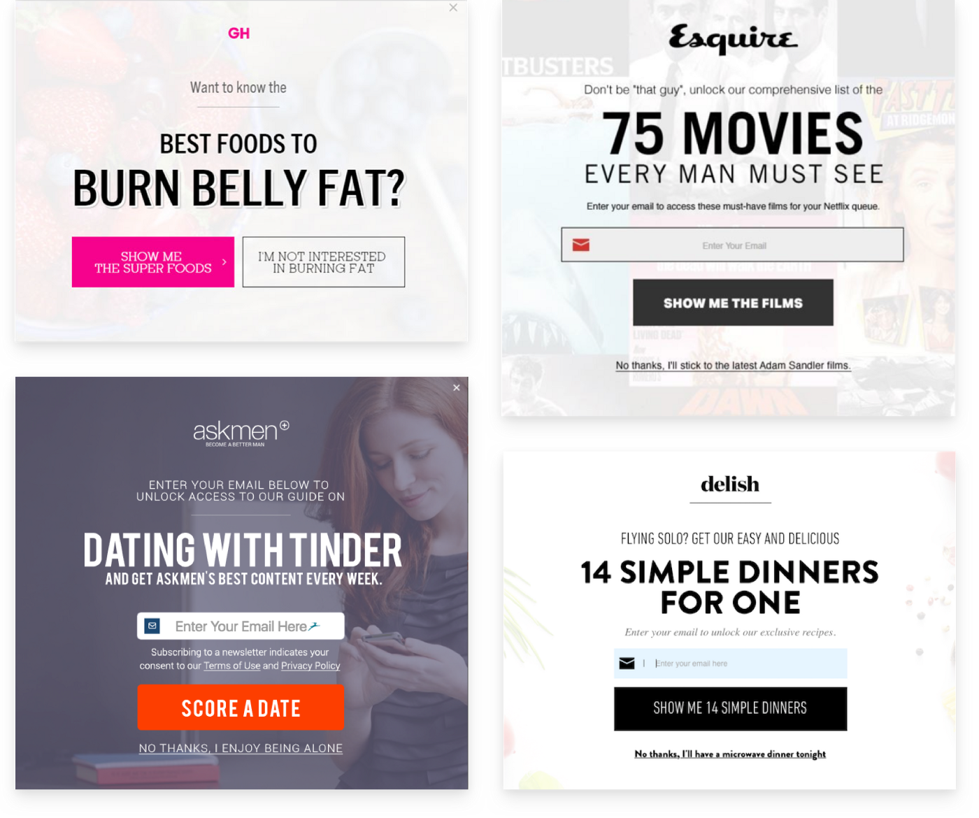 Examples of confirm-shaming — not opting-in means that you accept the website insulting or shaming you.
Types of content
In general, we usually divide digital content into 3 categories:
- Interface copy or microcopy — short text elements like labels for form fields, text on buttons, navigation labels, error messages, etc. The interface would break without them;
- Product copy — not necessarily a direct part of the interface, but plays an important role in the functioning of the product. It focuses on supporting the reader, like e.g. the body of the onboarding email.
- Marketing copy — connected with sales or promotion, often longer and focused on persuading the reader. Here you can be more creative.
Depending on the product, there can be many more categories to deal with. The most crucial one for designers is the first one — microcopy. However, clients sometimes need some guidance with other types of content, and for your design to work, it is best to address that at an early stage. If the blog posts are very long or difficult to understand, even the most beautiful UI won’t improve the user experience. And if the value proposition is not stated clearly enough, the bounce rate might be very high despite the new shiny information architecture.
This doesn’t mean you are responsible for the content that clients should produce themselves. But creating a draft can start a discussion, and discussion can lead to mutual understanding. After all, it is in your best interest as a designer for the product to work and perform best when it hits the light of the day. You can then create that Dribbble shot and attach the link to the real product with pride.
 Design and copy are inseparable
UX writing: DOs and DON’Ts
Below you can find some tips to get you started. A list of practices that you should avoid if you want to deliver a high-quality copy is longer than that. Think of it as a base on which you can build later on.
DOs
More and more companies create their own content style guides. They are connected with their brand identity, but also use the very basic principles of clear and appropriate style. Check Shopify, Mailchimp, Buzzfeed or even Material design content style guides for more inspiration and implement it in your own process. Don’t just copy it 1:1, though, as context of your users will be different depending on whether you are designing a banking app or a social media platform. Try to use these style guides to create your very own.
Try to cover all the possible errors, but while doing that, consider if you really need it. Can this problem be solved by changing the flow, layout, colors? You may discover that the error message can be avoided by simply getting rid of the error itself.
When starting a project, always agree on who is responsible for the content. As I’ve mentioned before, it doesn’t mean this person needs to write it all, but they need to manage it, start the discussion and make sure that this issue is being addressed.
Establish the values that will guide you throughout the process. For starters, try being helpful and human in your copy. This means empathy in error messages or avoiding technical jargon. Not sure if the text is understandable? Try to test a sample in one of the online tools like e.g. Hemingway App. It takes just a few seconds and you get feedback right away.
Make it easier for the user to take in information. Use numerals instead of words for numbers, especially those higher than 9. Replace dates with “today,” “yesterday,” “tomorrow.” Make sure button labels always have action verbs.
DON’Ts
Don’t try to be too clever with the microcopy. It is not about creative writing but being simple and transparent so that users do not even notice your choice of words. You can work on some more exciting phrases when writing a marketing text for the landing page. Still, in most cases short beats good. Users don’t read word for word and if the text is not easy to scan, they might just not read it at all.
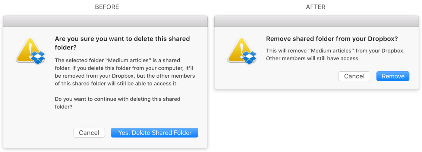 Which one of these messages are you most likely to read?
Don’t ignore the edge cases. If you don’t write the copy for every single error possible, there are two ways it can play out. One is that users will get the same error message each time, regardless of the problem. It is definitely not helpful and can get really annoying. Option two is that developers will write these texts for you, which often ends up being a very technical jargon. To avoid that, work closely with the engineers, learn about all the edge cases and address them with the right text.
Don’t forget about other languages. If your product has more than one language version, you need to consider that when designing. Otherwise, this small lovely button of yours will break when switching from English to German.
Avoid long blocks of text. It is easier to digest the information when it is divided into smaller chunks. Want to bring it to the next level? Add subheadings too. This way you can inform the users what they will find in the next couple of paragraphs.
Why it is worth it
Designers can’t be everything at once. But stepping out of your comfort zone has so many benefits that it is worth at least considering. And the art of writing needs to be cultivated — after all, it is one of the things that makes us human. If you want to practice writing outside of your work, start with things like Day One app. See how it goes and work your way up from there.
I was once told that good design does not require words. You can agree or disagree with that sentence, but from my experience as a UX designer, I’ve learnt that good design is based on a good copy — one does not exist without the other. Poorly written text can be misleading and even the prettiest mockups might not make up for it.
If you want to investigate this issue further, I recommend one (or all!) of the following 📚:
- Microcopy. The Complete Guide by Kinneret Yifrah
- Conversational Design by Erika Hall
- Content Design by Sarah Richards
More of a social media kind of person? Follow these folks for the hot news on UX writing: Sarah Richards, Kinneret Yifrah, Bobbie Wood, John Saito, Kat Holmes, Abby Covert, Jess Vice, Melanie Seibert.
You may also like

The Cost of Waiting: How Refactoring Your Legacy App Prevents Massive Technical Debt in 2026
31 May 2026 • EL Passion

One Partner, Full Delivery: Why End-to-End Agencies Beat Fragmented Teams for Speed-to-Market
31 May 2026 • EL Passion

We’re available for new projects.
