


Chapters

Guidelines to help designers make more realistic designs, in terms of development, when working on iOS projects.
When iOS developers cooperate with designers we work together to make one final product. The design team works ahead of the development team — which means that when the iOS team comes in to give an estimate, there can be some surprises in terms of cost. This is because the design work is not always realistic in terms of budget and time implementation.
There are some easy guidelines that designers can adhere to when working on a new product that will help to align the designer's, iOS developer’s and client’s goals for the product.
Never assume the coding of a design is easy
The question iOS developers are often asked is why a simple web page design takes so much time to port to native. Therefore, it’s essential to understand a fundamental difference between web and native development.
Imagine you want to display the upper part of the periodic table:
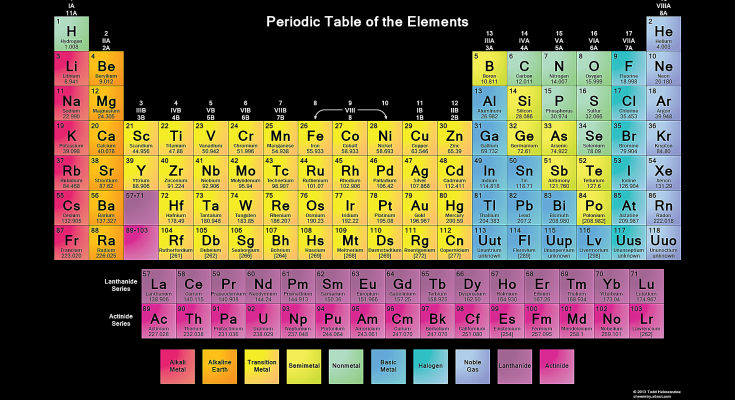 Periodic Table of the Elements [source]
In a web document, you describe the content. You specify that you want a 7x18 table with a solid black border. Then you put the letter ‘H’ in the first cell and style the cell with a green background.
In native development, however, you need to provide a recipe to draw this table to the screen:
- Draw a solid green square of size X starting at the (Y, Z) point.
- Draw the letter ‘H’ of size Q in the W point which needs to lay in the centre of the square.
- Draw a single black line underneath the square which is a bottom border of the first cell.
This recipe is what the web browser is responsible for. You tell the browser what to display, and it takes care of drawing it to the screen in a performant way. From this angle developing a native iOS app is like implementing a web browser rather than a web page.
Sins of custom designs
There are a couple of common problems that most custom designs share. Since those issues add up together to a fat bill for the development phase, it makes sense to try to eliminate them early in the design stage.
Designing for different screen sizes
At the time of writing the article, the latest iOS version 12 supports phones with screen sizes ranging from iPhone SE (568x320 pts) to iPhone Xs Max (896x414 pts). However, iPhone exclusive apps can also be opened on iPads in iPhone compatibility mode.
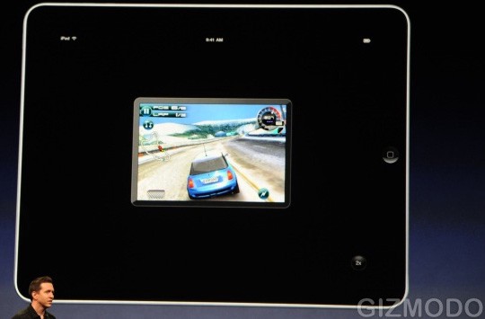 iPhone app compatibility mode on iPad [source]
In the compatibility mode, the app is rendered at iPhone 4 screen size (480x320 pts). Unfortunately, it’s not just a one-off, it’s more common than you might think.
Most App Store reviewers deliberately use iPads to review iPhone apps. If the app design is not fully functional on such a tiny screen, the submission will get rejected instantly. A good example would be a sign-up button not displaying on the small screen making the user unable to complete a registration process.
Comparing the two extreme screen sizes you can tell that using the same components’ sizes would mean over half of an iPhone Xs Max screen would be empty. This is never the case in real designs.
Still, it’s common to see custom designs prepared for the largest screen size only with no resizing attributes in place. This shifts the responsibility for specifying resizing rules on developers, which unnecessarily prolongs the development time.
Takeaway #1: Design for at least 2 extreme screen sizes and use resizable components.
Animations
Animations are very hard to get right. Most of the custom animations presented in top shots on Dribbble tick one or more checkboxes featuring animations that:
- are interactive (animation playback is controlled by user gesture),
- transition between the screens,
- override an existing system-wide solution.
This makes them expensive to implement. Why? Let’s find the answer based on one of the Dribbble shots from the Popular section.
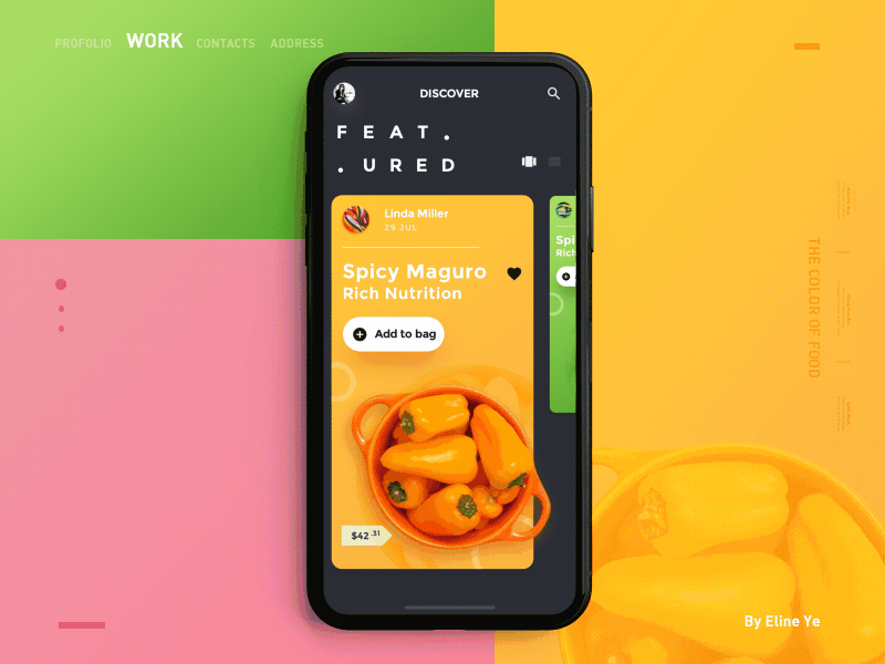 The colour of food shot having a nice animated transition between screens [source]
The shot features two distinct animations. First, the tile rotation while swiping left and right. Second, a sliding move-in transition between the screens. The latter one is especially troublesome.
To understand the problem, let’s do a quick recap of native iOS app navigation as described in Human Interface Guidelines from Apple:
Whenever possible, use standard navigation controls such as page controls, tab bars, segmented controls, table views, collection views, and split views. Users are already familiar with these controls, and will intuitively know how to get around your app.
And specifically for the hierarchical data:
Use a navigation bar to traverse a hierarchy of data. The navigation bar’s title can show the current position in the hierarchy, and the back button makes it easy to return to the previous location.
 The navigation bar is a simple concept familiar for iOS users [source]
Since the back button is located in the top left corner, on a larger device it’s impossible to reach with a single hand. That’s why iOS has a built-in interactive gesture which allows a user to go back without tapping the button.
 Interactive swipe from left to go back gesture is built-in into the native navigation bar [source]
How does the navigation bar relate to the custom animation from the nutrition shot? Since it redefines how a new screen is presented, it makes the developer responsible for re-implementing the default interactive gesture.
To achieve that, the developer needs to provide math equations which control the position of every single element on a screen in relation to time. And that’s very time-consuming.
What’s worse, on the detail screen there are images of categories and recent searches which are fetched from the web server. To make the animation beautiful, we need to preload those images for all nutrition choices when displaying the tiles. It could take minutes to display the list on a weak 3G connection! On the other hand, without preloading, we can only animate empty placeholders which take away all the flair.
Takeaway #2: Don’t animate transitions between different screens or interruptible actions.
Better animations with Lottie
A much better approach to native animations is to use Lottie. Lottie imports and plays animations exported from After Effects using Bodymovin plugin. It comes free of charge for iOS, but also for Android and web frontend.
From a native developer’s perspective, Lottie is almost a zero-cost solution. It also makes it very hard to go completely wrong with the animations. To create an interactive transitive animation you would have to include the whole UI of the app in the export, which sounds wrong from the get-go.
You can see Lottie in action by browsing lottie files repository. If you get stuck when starting to use Lottie, you can read more about how to overcome some of the limitations of this tool.
Takeaway #3: Make Lottie your go-to tool for native animations.
Not accommodating the data
Native apps by nature should fit the content to the width of the screen. That’s why it’s important to think about long and odd data when designing a custom interface. As obvious as it seems, it’s still common to see a custom design that cannot accommodate the data it was intended for.
In a shot presented below, we have popular courses portrayed with short names. However, if “After running tensile” was popular, there would be no way to fit its’ name into a tile. There’s no space for an additional line of text and if truncated, “After runn…” would make zero sense to the user.
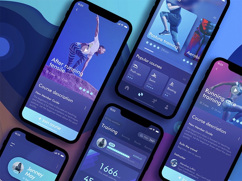 The exercise app shot with little space to fit popular courses names [source]
It’s not immediately clear, but the same issue may relate to user-generated images. Let’s see an example shot which presents a user profile with a collapsible profile pane.
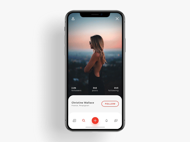 Social app example with user photos displayed in non-fixed aspect ratio [source]
To understand the potential issue, imagine you’re uploading a profile picture to your favourite social media app. The app will likely allow you to crop the image so that it fits nicely in the design.
Unfortunately, the presented UI changes the aspect ratio of the photo depending on the device’s height. What might be a great crop for your iPhone SE could potentially cut your arms on your friend’s iPhone 8 Plus.
Takeaway #4: Experiment with odd and long data and prevent them from breaking the design.
"Infinite Views"
Imagine a list of items displayed in a native app. It might be the Settings app on your iPhone. We know that there’re only 5 setting types for all users and this will never change upon any action.
However, a list might also be your contact book. In this case, we don’t know the number of items upfront. It changes over time and is different for every user. Potentially, we can have an infinite number of contacts, so let’s call this kind of list an “infinite view”.
The “infinite view” looks standard, but it needs to be coded differently by an iOS developer. Even though it might have thousands of entries, at any given scroll position, there are a limited amount of items that can be displayed simultaneously. That’s why reusable views are used for performance.
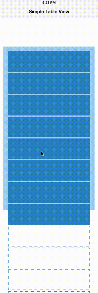 Reusing cells on iOS [source]
The problem with “infinite views” is that interactions are even harder and more limited. They also take up the whole scrollable space, so it’s better to isolate them on separate screens.
Consider the shot presented below. It has two “infinite views” side by side which is fine, but it also shows a drag&drop like animation between the two. That would take way longer for a native developer to implement due to dealing with “infinite views”.
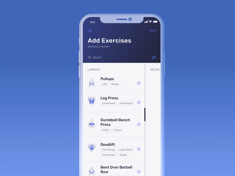 Adding exercises shot with drag&drop between two “infinite views” [source]
Takeaway #5: Isolate potential “infinite views” on separate screens. When in doubt, always try to consult the developer first.
Designs you can bring to life
One of your considerations as a designer should be to make it easier for iOS developers to bring your designs to life. The easier the development is, the faster it’s shipped to the AppStore, therefore making your customer happier.
Moreover, by adhering to the presented guidelines you will be able to detect potential UI traps and it’ll prevent you from having to re-iterate the same design over and over again.
If you wonder how expensive the design mistakes can be, take a look at the second part of this post where I provide real-life cost estimates for a number of Dribbble designs!
You may also like

The Product Health Check: How to Find Performance Bottlenecks Before They Cost You Users
5 July 2026 • EL Passion

Staff Augmentation vs. Managed Teams: Which Model Saves You More on Long-Term Overhead
5 July 2026 • EL Passion
The Cost of Waiting: How Refactoring Your Legacy App Prevents Massive Technical Debt in 2026
31 May 2026 • EL Passion
We’re available for new projects.
