


Chapters

Website redesign is a process of remodelling your website completely; revamping the structure, content, and design. But how to do it effectively to get the results you want?
The first question you need to ask yourself is why you want a redesign in the first place. Is your platform not getting the conversions you want? Are you losing users? And secondly: do you actually know why these things are happening, or are you just guessing?
If you're unsure about either, take a step back and try to determine the exact reasons to see if your website needs a full redesign.
Many companies approaching us say that they need a redesign, but they’re focused only on the visuals. As if, somehow, flat design and a set of new isometric illustrations could fix all problems and make their conversion and engagement numbers skyrocket in front of their very eyes.
The question is: how to enter the website redesign jungle and avoid getting eaten along the way, and actually improve your website?
Don’t just assume, learn
4 out of 10 companies coming to us for a website redesign want to cut off the research phase first. Don’t be one of them. After 9 years on the market, we know: research will save some of your hard-earned money. Only by doing your research first, you can be sure that you’re addressing the problems your users are facing not the ones you think they have.
One of the products we designed for the Norwegian market was to support obesity treatment. When we began the UX strategy phase, we had a choice. We could match the competition, or we could derive original ideas from the real world. We chose the latter and interviewed multiple patients and healthcare professionals from Norway. Without that insight, we would have delivered a generic app, not a meaningful solution to real patients’ problems.
Research minimizes the overbearing risk of over-investing in features, screens, interactions that are irrelevant for your end-user. To quote one wise man and a UX design legend:
“A brilliant solution to the wrong problem can be worse than no solution at all: solve the correct problem.”
Don Norman
Establish what is working on your website, and what is not
If you have a website on the market, you already have a handful of data at hand. Google Analytics reports, Heat maps analyses, probably other tools and scripts tracking your website’s performance. All this data provides invaluable insight on how users interact with your product, and this should be your first step on the way to determine what is working and where you’re not doing so great.
Try to dig deeper to unveil the main shortcomings of your current product.
Be a detective: don’t stop only at the big metrics, like the number of app installs, sales or user retention. Dig deeper.
- Is there a feature that people don’t use at all?
- Where do users most commonly drop out?
- Do they happen to click on un-clickable elements when searching for something?
These are just a couple of micro-conversion examples, so a single action that a user undertakes on the way to the primary conversion goal. This is where your low-hanging fruits grow; take them.
You can also benchmark your website against your competition and see where your product can shine in comparison and what elements are too pricey or time-consuming to invest in.
We performed a UX Audit of the popular Polish search tool enabling users to find sports facilities nearby. Very few users were using the tool’s filters to optimize their search. We realized that the filter buttons are unnoticeable for them and they perceive them as static icons rather than clickable buttons. We suggested implementing regular checkboxes to increase the product’s usability.
 A UX Audit is an expert’s evaluation of your digital product’s user experience.
If you feel lost or don’t have time and resources, you might want to consider a third-party UX audit done by professionals. A well-conducted UX audit is the shortest way to establish your website's or app's main shortcomings, but also unveil potential in places you didn’t know you have.
Establish KPIs and your website redesigns goals
So you’ve discovered some of your users’ pain points. Probably a lot of them. But not all problems are of the same weight on your business. You need to prioritize. Set clear and straightforward website redesign KPIs that you can actually measure. It will not only give you a sense of direction at the beginning, but it will also help to notice when you spend too much time on things that were not considered your priority in the first place. Don’t lose sight of your primary redesign goals and KPIs trying to patch everything up.
Effective design solves problems
“Does this button need to be red or blue?”
First and foremost, it needs to be in the right place to be visible for the user. Then, it needs to have a compelling microcopy. Then, you may talk color.
Building and rebuilding digital products is a strategic mission and it needs to be treated as such. Don’t ever drop usability for the sake of flashing design.
Remember that the prettiest redesigns do not always equal the most usable.
And whereas, outstanding visuals is what attracts users to your website, the usability and accessibility of this design is what’s going to keep them there. 32% of customers will leave a brand they love after just ONE bad experience.
Let’s take Snapchat and their brave attempt at separating user-generated content from advertiser-generated content. It’s not the visuals that failed, but the wrong assumption the users will readily adapt to the overbearing change that Snapchat prepared.
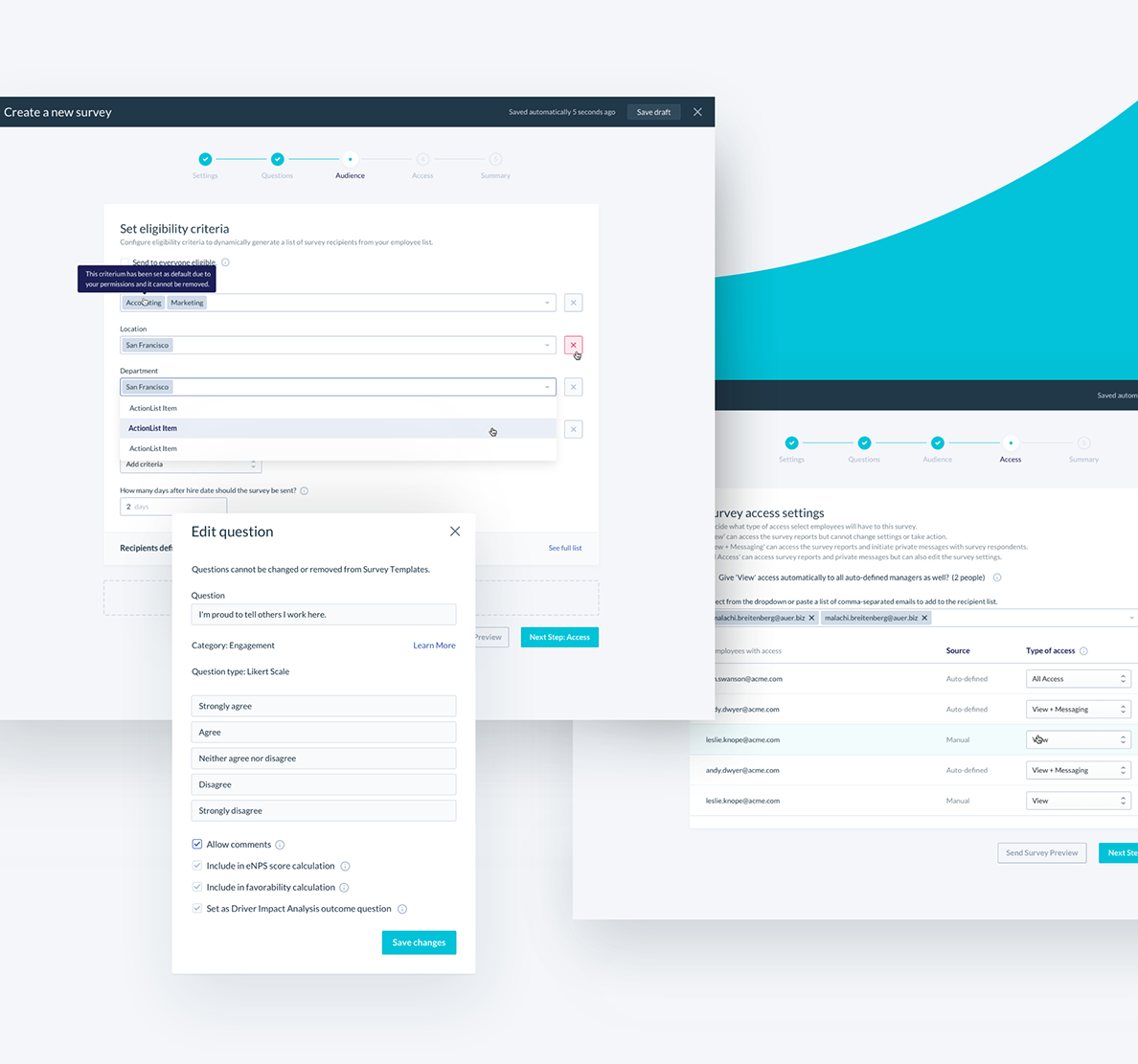 Redesigning the survey creation screens for Hyphen (now Betterworks)
We had the chance to redesign a complex employee analytics platform, Hyphen (now Betterworks). The technology and features were all there; they were just not that easy to use.
We identified two core issues with the platform and simplified the whole experience. One of the biggest challenges for the users was the new survey creation process. Instead of a fixed, tabbed approach, we incorporated an easy-to-use wizard pattern to walk the user through all of the steps.
Aesthetics is the cherry on top. But it has to be scalable.
Visuals complement and finish off your product. Yes, they should be clean, modern and appealing. But you need to remember that design, just like code, needs to be scalable.
With a well-crafted design system created by professionals, some small tweaks to your website’s or product content do not possess a problem, and there is no risk that it will start looking messy or out of place compared to the original designs.
Learn from others' website redesign mistakes
An effective and efficient website redesign is not about pretty shiny pixels. It’s about pretty pixels in all the right places. Building a website, and evaluating how it works is like everyone’s least favorite Facebook relationship status: a bit… complicated.
Pretty does not always equal effective. We’ve seen it all. Be it a giant like Microsoft with their Windows 8 start menu revolution, or Snapchat trying to alter their business model: a lot of redesigns fail. It seems that no company is safe in the terrifying jungle of redesigning your product.
There is a lot of pressure that your product stays current and fresh.
Website redesign is vital to maintain your product growth and scalability.
And yes, implemented correctly, with a consciously set goals and data-driven processes, you’re one step closer to succeeding.
Check out also
- UX Audit: A Quick Win For Your Digital Product to learn about how a well conducted UX Audit can contribute to your redesign goals.
You may also like

The Cost of Waiting: How Refactoring Your Legacy App Prevents Massive Technical Debt in 2026
31 May 2026 • EL Passion

One Partner, Full Delivery: Why End-to-End Agencies Beat Fragmented Teams for Speed-to-Market
31 May 2026 • EL Passion

We’re available for new projects.
