


Chapters

TL;DR
Micro-interactions are small, focused UI responses, such as immediate button feedback, inline error messages, and clear loading states, that help users understand system status and avoid mistakes. UX research shows these interaction details are critical to usability and task success. At the same time, academic studies find that well-designed micro-interactions improve user engagement and satisfaction compared with static or delayed feedback. Their impact comes from clearer communication, better error prevention, and smoother task flows, not added complexity or AI features. Implemented consistently across web, mobile, and PWAs, micro-interactions deliver measurable UX gains without training data, API costs, or automation risks.
How Micro-interactions Improve UX?
While product roadmaps fill up with AI features like chatbots, recommendation engines, and predictive analytics, the fundamentals that actually drive conversion and retention often get overlooked. UX research consistently shows that small interaction details, how systems respond, signal status, and prevent errors, play a critical role in whether users complete tasks smoothly or abandon them in frustration.
Despite this, product discussions frequently jump straight to automation and advanced functionality. What's often missing is focus on the small, repeatable moments users encounter dozens of times in every session. These moments shape how intuitive, reliable, and trustworthy a product feels. This is precisely where micro-interactions matter.
Micro-interactions are the small, focused UI responses that guide user behavior and communicate system status. A button that immediately acknowledges a tap. A form that flags an error as it happens. A subtle confirmation that an action succeeded. Research and UX practice show that this kind of timely, contextual feedback improves usability, helps prevent errors, and reduces user uncertainty across web apps, mobile products, and PWAs.
Academic and experimental studies further support this impact. Interfaces enhanced with well-designed micro-interactions have been shown to increase user engagement and satisfaction compared with static or delayed-feedback designs. These improvements come from a more transparent system communication, better error prevention, and smoother task flows, not from added complexity.
Importantly, micro-interactions deliver these benefits without training data, model maintenance, or AI-related risks. They rely on established UX principles and careful implementation rather than advanced technology.
This guide explains what micro-interactions are, where they have the greatest impact on user experience, and how to design and implement them effectively at scale.
Key Takeaways:
1. Micro-interactions drive measurable UX and business results
Small interaction details—like instant feedback, validation, and status indicators—can significantly reduce friction, lower error rates, and improve retention and satisfaction, often outperforming complex feature additions.
2. Every effective micro-interaction follows a clear structure
Successful micro-interactions are built from four parts: triggers, rules, feedback, and loops/modes. This structure ensures interactions are predictable, scalable, and purposeful rather than decorative.
3. Platform context determines which micro-interactions work best
Web, mobile, and PWAs require different patterns—hover and inline validation for web, touch and haptics for mobile, and lightweight transitions and offline indicators for PWAs. Reusing the same patterns across platforms reduces usability.
4. High-impact moments deserve the most design investment
Onboarding, forms, navigation, loading states, errors, search, and critical actions are where micro-interactions deliver the highest ROI by reducing uncertainty and guiding users through decisions.
5. Discipline matters more than visual flair
Purposeful timing (100–300 ms), accessibility support (including reduced motion), performance optimization, and consistency within a design system are essential. Poorly implemented micro-interactions can harm usability rather than improve it.
What Are Micro-interactions?
To understand why these tiny moments have such an outsized impact, it helps to start with a clear definition of what micro-interactions are and how they're structured.
Micro-interactions are small, focused UI elements that guide user actions, provide feedback, and create intuitive digital experiences.
In UX and interaction design, they're task-oriented events triggered either by user actions—like tapping a button or swiping a card - or by system events, such as receiving a notification or completing a background process.
These interactions form the foundation of modern product design across web apps, mobile applications, and PWAs because they make interfaces feel responsive, alive, and effortless to use.
How Micro-Interactions Work: Triggers, Rules, Feedback, and Loops
Every micro-interaction, no matter how simple, consists of four fundamental parts:
- Trigger: What initiates the interaction? Triggers can be user-driven (clicks, swipes, taps, hovers) or system-driven (timeouts, incoming messages, completed uploads). For example, clicking a "Submit" button is a user-triggered event, while a low-battery notification is a system-triggered event.
- Rules: What happens next? Rules define the logic and boundaries of the interaction—what's allowed, what's not, and how the system responds. If you're uploading a file, the rules determine size limits, acceptable formats, and what happens if something goes wrong.
- Feedback: How does the user know something happened? Feedback includes visual cues (color changes, animations), motion (button presses, page transitions), haptic responses (vibrations), or sound (notification chimes, confirmation beeps). Good feedback is immediate and unmistakable.
- Loops and Modes: How does the interaction behave over time? Loops handle repetition—like a loading spinner that keeps spinning until a task completes. Modes adjust behavior for specific contexts—a "Do Not Disturb" mode that silences notifications or a dark mode that changes the entire interface appearance.
Examples:
- Hovering over a button that changes color (trigger + feedback
- Real-time “Password too short” message (trigger + rules + feedback)
- Pull-to-refresh animation (trigger + feedback + loops)
- A toggle that shifts smoothly between states (all four components)
Why Micro-interactions Matter in UX?
Understanding the parts is one thing. Understanding the value is another. Micro-interactions play a strategic role in UX because they shape how users interpret the interface in every moment. They're not decorative flourishes; they're functional UX elements that influence clarity, confidence, engagement, and trust.
- Usability Improvement: Micro-interactions make interfaces easier to navigate. Clear button states reveal what’s clickable, transitions reveal how screens connect, and progress indicators reduce uncertainty during wait times.
- User Feedback Clarity: When users toggle a setting or submit a form, they need instant confirmation. Micro-interactions provide that clarity through motion, color shifts, checkmarks, sounds, or haptics.
- Task Completion Confidence: Uncertainty is the enemy of conversion. Micro-interactions eliminate guesswork with real-time validation, accurate progress indicators, and step-by-step guidance.
- Emotional Engagement & Delight: A playful animation, a soft vibration, a clever success moment, these touches create emotional connection and product affinity.
- Brand Consistency & Product Identity: Motion, feedback, and tone become part of the product personality. Consistent micro-interactions across touchpoints make the experience feel polished and intentional.
The benefits of well-designed micro-interactions show up directly in product metrics:
- Reduced task friction: Well-designed micro-interactions help users complete tasks with fewer actions and lower cognitive effort (Nielsen Norman Group)
- Lower error rates: Real-time validation and inline hints reduce input mistakes in web forms (MMI Basel, Google Research)
- Higher user retention: Better UX drives customer loyalty and improved financial performance (Forrester CX Report, Business Impact Study)
- Increased satisfaction: Responsive feedback and subtle animations boost perceived quality (Google Micro-Moments, UX Design Articles)
What Types of Micro-interactions Are Used Across Web, Mobile, and PWAs?
Micro-interactions take different forms depending on platform constraints, user context, and interaction patterns. What works on desktop doesn't always translate to mobile, and PWAs require their own considerations for bridging web and native experiences.
Understanding these platform-specific patterns helps you implement micro-interactions that feel natural and appropriate for each environment.
Micro-interactions in Web Apps
Web apps benefit from micro-interactions that leverage screen real estate and pointer precision:
- Button hover states signal interactivity before clicks happen - color shifts, subtle shadows, or icon movements that confirm an element is actionable. This pre-click feedback prevents users from clicking non-interactive elements.
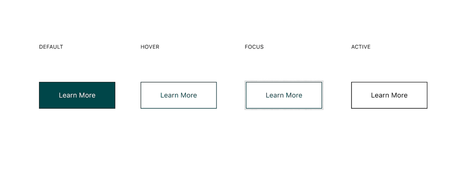
source: GitHub
- Inline validation messages appear immediately as users type, catching errors like weak passwords or invalid email formats before form submission. Real-time feedback prevents the frustration of filling out an entire form only to discover multiple errors at the end.
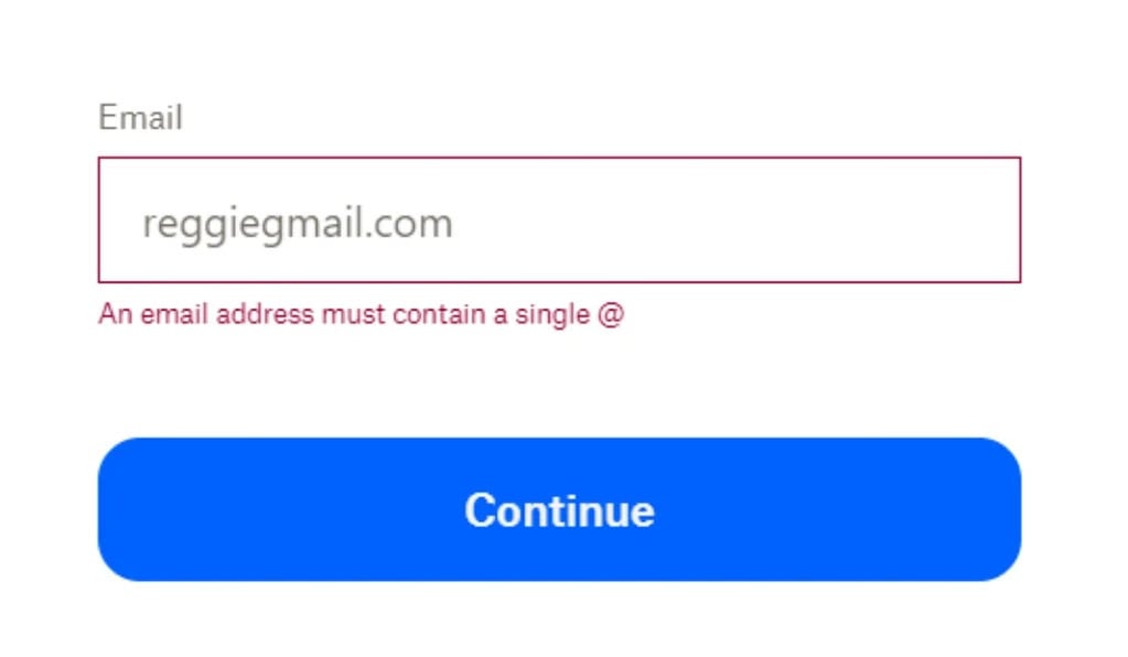
source: Clearout
- Loading animations manage expectations during data fetches or processing. Skeleton screens that mimic content layout, animated spinners, or progress bars keep users informed instead of staring at blank screens, wondering if something broke.

source: Forloveyet
- Empty-state animations turn potentially dead-end moments into engaging experiences. When a search returns no results or a new user has no data yet, animated illustrations or helpful prompts guide next actions instead of leaving users stranded.

source: Vecteezy
These patterns make web interfaces feel responsive and reduce the cognitive load of figuring out what's clickable, what's processing, and what went wrong.
Micro-interactions in Mobile Apps
Mobile interactions prioritize touch feedback and gesture clarity:
- Tap effects provide immediate confirmation that touch registered - ripple animations spreading from the tap point, brief color flashes, or scale changes that make buttons feel physically pressed. Without this feedback, users often tap multiple times, unsure if their first tap worked.
- Gesture-based feedback makes swipe, pinch, and drag interactions discoverable and satisfying. Cards that slightly move when you begin swiping signal they're dismissible; photos that bounce when you've zoomed to maximum show you've hit a limit. These visual responses teach users what gestures are available.

source: Smashing Magazine
- Haptic feedback adds a physical dimension to interactions. A subtle vibration when toggling a switch, a gentle buzz confirming a successful payment, or a distinct pattern when reaching the end of a scrollable list. Haptics work especially well for critical actions where visual confirmation alone isn't enough.
- Pull-to-refresh indicators signal that pulling down will reload content. The animation evolves as you pull, starting as a subtle arrow, transforming into a spinning loader once you've pulled far enough, confirming the refresh is happening.
Mobile micro-interactions compensate for smaller screens and the lack of hover states, making touch interactions feel precise and intentional.
Micro-interactions in PWAs
PWAs sit somewhere between native apps and traditional websites, and their micro-interactions reflect that hybrid nature.
- Installation prompts use animations and messaging to encourage adding the PWA to the home screen without being pushy. A slide-up banner with a subtle bounce draws attention without blocking content.

source: Developer.Chrome.com
- Offline indicators & offline UX clearly communicate connectivity status. A discreet banner sliding in when the connection drops, turning green when it returns, with smooth transitions that don't jar users out of their flow.
- Lightweight transitions help PWAs feel more like installed apps. Subtle fades, slides, or scale effects create a sense of continuity without harming performance, even on modest devices. Motion respects system-level preferences, reducing or disabling animation when OS settings request it—while still keeping state changes understandable. Transition direction and depth signal hierarchy (e.g., slide-in for forward navigation, fade-back for dismiss) so users always know where they are. All motion is designed with performance-friendly properties (opacity and transforms) to maintain fluidity.
- System-level notifications extend engagement beyond the browser, but only when handled responsibly. Permission requests appear just-in-time, triggered by explicit user intent - “Track this order,” “Alert me about new posts” - not on first load. Users can select notification categories and frequency, reducing fatigue and keeping expectations clear. Quiet hours and server-side throttling avoid disruptive timing. Notifications remain concise, actionable, and deep-linked to relevant PWA views, often with buttons like “Reply,” “Snooze,” or “View.”
PWAs require careful balance. enough micro-interaction polish to feel native without the file size and complexity that defeat the PWA's lightweight advantage.
Delight-Driven Micro-interactions
Beyond functional patterns, some micro-interactions exist primarily to add personality and emotional resonance to the experience.
- Celebratory animations reward user achievements, confetti bursting when completing a goal, fireworks after a purchase, or animated mascots cheering progress milestones. These moments create memorable peaks in the user experience.
- Confirmation checkmarks can be purely functional or inject personality. A simple checkmark fading in confirms completion. An animated checkmark that bounces, draws itself in, or includes a subtle sound effect transforms a mundane confirmation into a satisfying moment.
- Micro-brand moments express product personality through interaction details. Slack's loading messages, Mailchimp's high-five animation, Duolingo's owl reactions. These small touches make products feel human and distinctive. The key is restraint: delight works when it enhances the experience, not when it slows users down or becomes repetitive.
Delight-driven micro-interactions separate forgettable products from memorable ones, but they only work when functional micro-interactions are already solid. Get the basics right first, then add personality.
Where Micro-interactions Have the Biggest Impact in UX?
Not all screens and flows benefit equally from micro-interaction investment. Focus on moments where users need clarity, reassurance, or guidance - these are where thoughtful micro-interactions deliver the highest return on design effort.
Onboarding Flows
First impressions decide whether users understand your product or abandon it in confusion. Micro-interactions remove that uncertainty: animated pointers highlight key features without overwhelming users with text, progress indicators show how many steps remain and prevent “endless setup” anxiety, and contextual tooltips teach by doing. Celebratory animations after each completed step build momentum. Poor onboarding loses users instantly; smart micro-interactions guide them to their first moment of success.
Form Completion and Validation
Forms are classic abandonment points. Real-time validation surfaces errors as users type, preventing the “submit and discover problems” frustration. Password strength meters that animate from red to green provide immediate clarity. Auto-formatting for phone numbers and credit cards reduces mistakes. Subtle success animations on correctly filled fields create momentum through longer forms.
Navigation and Menu Interactions
Navigation should feel effortless. Animated hamburger menus that expand smoothly reinforce cause and effect; breadcrumbs clarify where users are within complex hierarchies. Sliding tab indicators make active sections unmistakable, and distinct active states ensure users always know their position.
State Changes (Toggles, Filters, Modes)
Micro-interactions make system changes feel intentional. Toggles that slide cleanly communicate binary choices. Animated checkmarks confirm applied filters. Smooth transitions into dark mode prevent jarring visual shifts. Brief undo toasts after destructive actions provide safety without breaking flow.
Loading, Processing, and Transitions
Waiting doesn’t have to feel slow. Skeleton screens that mirror final content feel faster than spinners, progress bars with accurate estimates reduce upload anxiety, and animated transitions between screens preserve spatial context. Optimistic UI—showing immediate success before server confirmation—makes interactions feel instant and responsive.
Error States and Recovery
Errors don't have to be punished. Clear messages paired with animated icons draw attention without intimidation. Inline suggestions guide users toward fixes. A gentle shake animation on a failed password conveys the issue without confusing text. Undo options with countdown timers restore confidence. Lighthearted illustrations can defuse frustration while still explaining the problem.
Search and Discovery
Search should feel responsive and helpful. Auto-complete suggestions appearing smoothly accelerate input. Search results fading in give the interface polish. Filter animations showing real-time updates confirm system response. “No results” states with animated suggestions redirect users productively, and a recent-search history with clear indicators enables quick retries.
Critical Actions and Confirmations
High-stakes actions demand clarity. Buttons with loading states prevent double submissions. Confirmation modals with a clear visual hierarchy highlight consequences. Success animations after purchases create meaningful positive peaks. Progress indicators in multi-step checkouts reduce abandonment. Distinctive warnings for destructive actions prevent accidental data loss.
Key Fact: Micro-interactions have the greatest impact wherever users face uncertainty, friction, or critical decisions. Invest in these moments first; they consistently produce measurable improvements in completion rates, satisfaction, and retention.
Best Practices for Designing Effective Micro-interactions
Once you know where micro-interactions matter most, the next step is designing them well. Effective micro-interactions consistently follow proven principles.
Keep Interactions Purposeful, Not Decorative
Every micro-interaction should exist to solve a usability problem. Animation for its own sake slows users down and dilutes meaningful feedback. Before adding one, ask: Does this help users understand what’s happening, confirm an action succeeded, or guide the next step? If the answer is no, remove it. Purposeful micro-interactions improve clarity and task completion; decorative ones add noise.
Follow Timing Guidelines for Motion
Timing directly shapes perceived responsiveness. Too fast feels abrupt; too slow feels sluggish. Research indicates that optimal UI motion is between 100 and 300 ms. Small interactions like button presses typically land at 100–150 ms, while larger transitions—modals, drawers, panel shifts—work best at 200–300 ms. Anything beyond 400 ms feels noticeably slow. Always test on real devices; timing that feels crisp on a desktop may drag on mobile.
Prioritize Accessibility
Micro-interactions must support all users. Respect prefers-reduced-motion, many who enable it experience vertigo or motion sensitivity. Provide static alternatives or highly subtle motion. Avoid relying on color alone; pair it with icons, patterns, text, or position changes for colorblind users. Use haptic or audio cues when appropriate. Test with screen readers to ensure feedback doesn't become confusing or noisy. High-contrast modes should preserve clear, visible state changes.
Maintain Consistency Across Components and Platforms
Inconsistent micro-interactions force users to relearn behavior. If one button scales on hover and another fades, predictability disappears. Establish patterns: uniform button feedback, unified validation timing, consistent loading behavior. Document them in your design system. Keep patterns familiar across platforms, but adapt respectfully—hover states don’t apply on mobile, and haptics don’t exist on desktop.
Balance Subtlety With Clarity
Micro-interactions should be noticeable enough to inform, but subtle enough not to distract. A button press doesn’t need a dramatic animation; a validation success shouldn’t block the interface with celebratory effects. The ideal outcome: users get the feedback instantly, without interrupting their flow. When unsure, start subtle—you can always increase emphasis if users miss the signal.
Focus on Performance
A poorly optimized micro-interaction undermines the experience it’s meant to enhance. Jittery or lagging animations feel broken. Favor GPU-friendly properties like transforms and opacity over layout-affecting changes like width or top/left. Reduce complexity on low-powered devices. In PWAs, minimize the use of animation assets to speed up load times. On mobile, avoid heavy animations during scroll or drag gestures. Test on budget devices, not just flagships; a smooth, simple animation always beats a complex stuttering one.
Test and Iterate With Real Users
Intuition isn't enough. Observe how real users respond: Do they notice validation feedback? Do loading states reduce anxiety? Do animations still feel right on the tenth repetition? A/B test micro-interactions tied to conversions or task completion. What looks clever in design tools may irritate users in real workflows.
How to Integrate Micro-interactions Into the Design and Development Process
Good design is only half the equation - micro-interactions need to be embedded into the workflow.
- Identify High-Impact Touchpoints: Focus on moments of hesitation, confusion, or decision.
- Use UX Research to Find Friction Points: Session recordings, heatmaps, and interviews reveal missed expectations.
- Prototype Micro-interactions Early: Test timing, motion, and feel before engineering invests heavily.
- Collaborate Between Design & Engineering: Specify timing, easing, triggers, and edge cases. Pair on implementation.
- Build Reusable Patterns Into the Design System: Codify animations, loading states, and validation patterns for consistency.
- Test & Iterate With Real Users: Roll out gradually, measure impact, and refine.
- Optimize for Performance & Accessibility: Audit animation performance, test on real devices, and ensure inclusivity.
Workflow: Research → Prototype → Collaborate → Systematize → Test → Optimize
Why Micro-interactions Are Fundamental to Usable Digital Products
Micro-interactions represent decades of research into how people actually interact with digital products. They're not about adding polish when there's time. They're fundamental to how users understand, navigate, and trust your product.
The implementation path is straightforward: identify friction points through research, design purposeful solutions, build reusable patterns into your design system, and measure results. Start with the moments that matter most - onboarding, forms, navigation, critical actions - where minor improvements create compounding returns.
Strategic micro-interaction design respects users' time, attention, and cognitive load. Every smooth transition and timely piece of feedback signals thoughtful design. In a landscape of rushed releases and feature bloat, that attention to foundational experience stands out.
The question isn't whether to invest in micro-interactions, but whether you can afford to ignore them. While competitors add complexity, smart teams optimize the interactions users encounter every session. That's where measurable business outcomes happen.
Invest strategically. Measure rigorously. Scale systematically.
FAQ: Micro-interactions In Digital Products
How do we measure the ROI of investing in micro-interactions?
Track three metric categories: Behavioral (task completion rates, time-to-completion, error rates, abandonment), Business (conversion rates, retention, support tickets), and Satisfaction (NPS, user surveys). Establish baselines during discovery, then measure post-launch improvements. Companies typically see meaningful improvements in conversion rates on optimized flows and notable reductions in errors. A/B testing specific flows provides the strongest evidence. Good agencies set up analytics dashboards and measurement frameworks as standard deliverables.
What deliverables should we expect from a design agency for a micro-interactions project?
Core deliverables include: interactive prototypes with timing specifications, motion design documentation, an updated component library, accessibility guidelines, developer handoff docs with code examples, a QA checklist, and an analytics setup. Critically, expect design system integration, micro-interactions documented as reusable patterns with design tokens for timing and easing that developers can reference directly. Request workshops to train your internal team on extending these patterns.
How do we ensure micro-interactions remain consistent as our product evolves?
Build a micro-interaction design system documenting every pattern: triggers, timing, feedback types, and accessibility requirements. Maintain this in your component library alongside visual design elements. Implement governance: require design review for new interactions, schedule regular audits, and train internal teams on principles. Consider a retainer to support the agency's periodic review of new features. Upfront documentation investment pays off as your team scales.
What happens if users with accessibility needs or older devices have problems with micro-interactions?
Responsible agencies design for graceful degradation from the start. All interactions should respect prefers-reduced-motion, include non-visual alternatives, work with screen readers, and meet WCAG accessibility standards. For performance, use progressive enhancement—core functionality works without animations, enhancements load based on device capability. Test on older budget devices, not just current flagships. Request accessibility audit reports and device compatibility matrices as standard deliverables.
How do micro-interactions fit into our existing design system and development workflow?
Micro-interactions should extend your existing design system, not replace it. Agencies should add motion tokens (duration, easing, delays) alongside existing design tokens, create interactive component documentation, and provide reusable code patterns. For developers, this means pulling documented patterns, precise timing specifications, performance metrics, and QA checklists into the normal workflow. Best implementations feel invisible to your existing process. Claude can make mistakes. Please double-check responses.
You may also like

The Product Health Check: How to Find Performance Bottlenecks Before They Cost You Users
5 July 2026 • EL Passion

Staff Augmentation vs. Managed Teams: Which Model Saves You More on Long-Term Overhead
5 July 2026 • EL Passion
The Cost of Waiting: How Refactoring Your Legacy App Prevents Massive Technical Debt in 2026
31 May 2026 • EL Passion
We’re available for new projects.
